Midvale Senior Center
Midvale
- Catalog No.2615
- ClientSalt Lake County
- Area20,564 SF
- Completion2016
- Awards
- 2019 AIA National Design for Aging Review - Award of Merit
- 2018 AIA Western Mountain Region Design Excellence Citation
- 2018 ACEC Honor Award
- 2017 AIA Utah Urban Design Merit Award
- 2016 IIDA - Intermountain BEST Award - Give: Healthcare, Senior Living
- 2015 AIA Utah Honor Award
- 2015 Utah Design and Construction Most Outstanding Public Project (Under 10M)
- Certifications
- LEED Gold
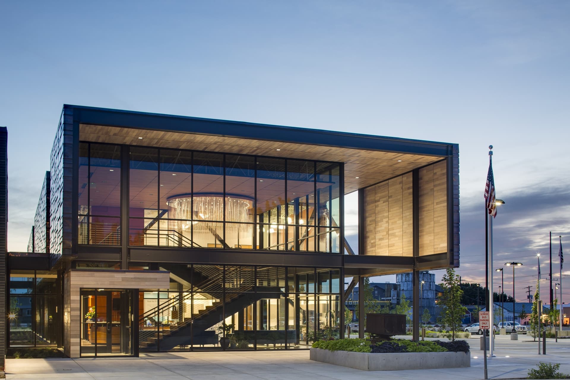
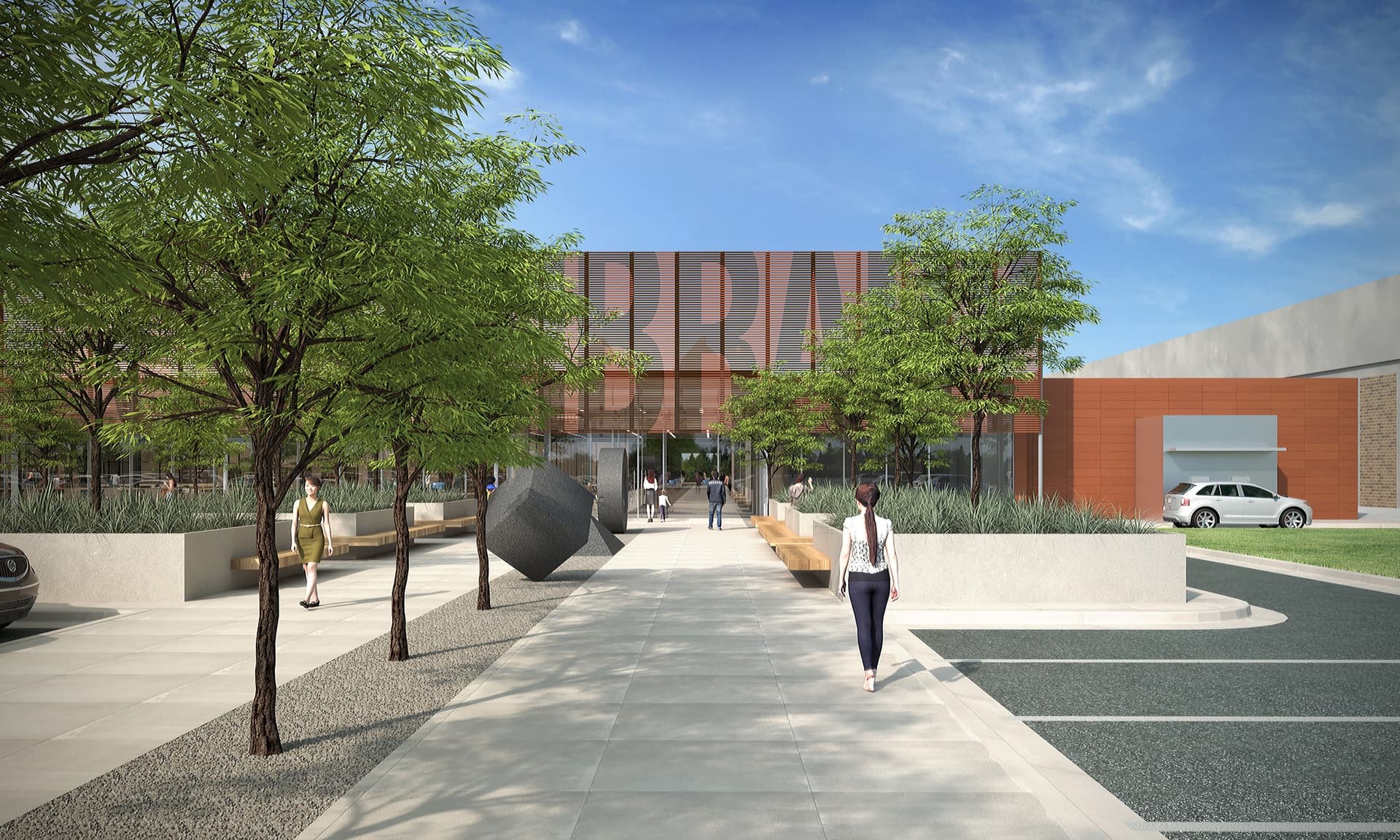
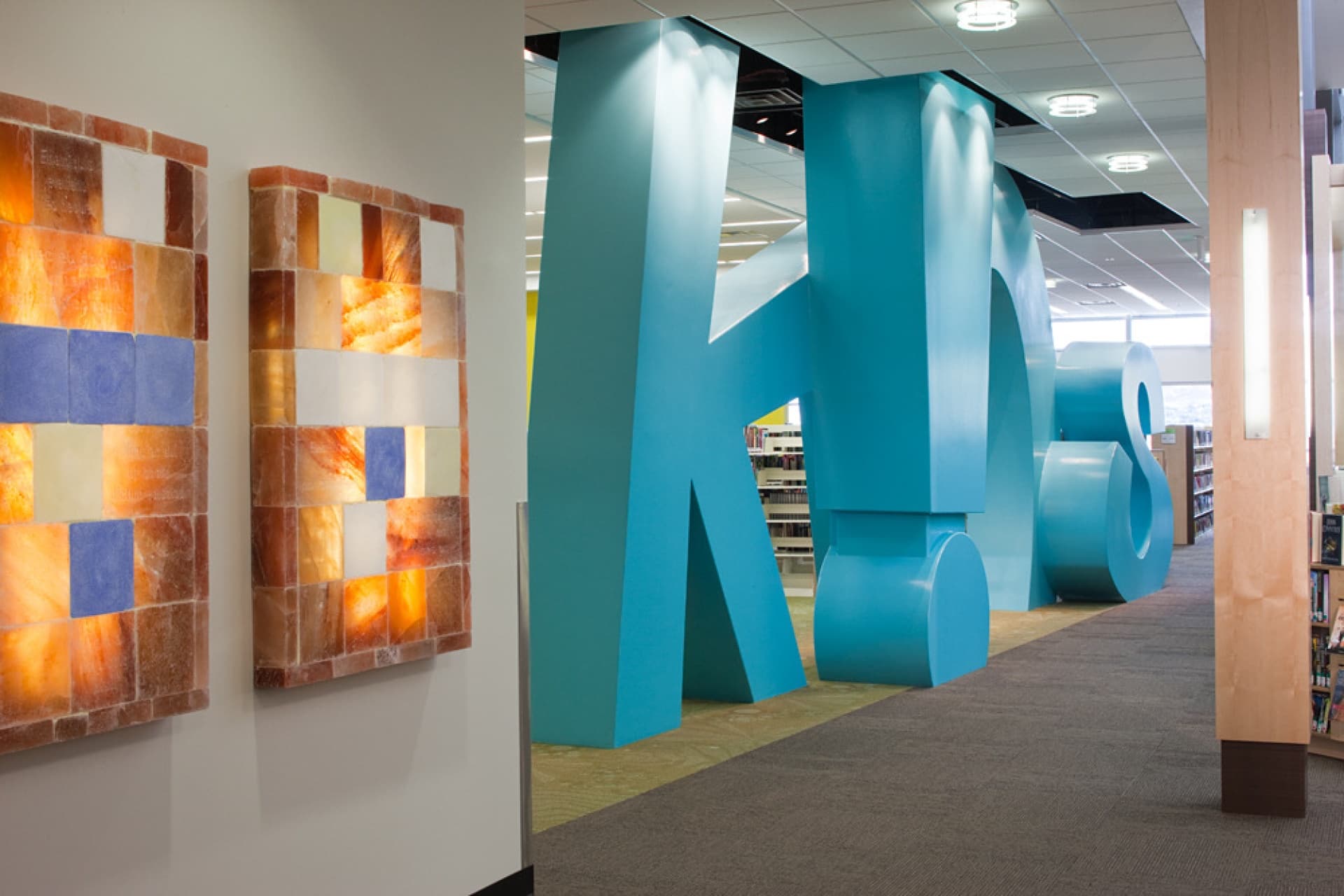
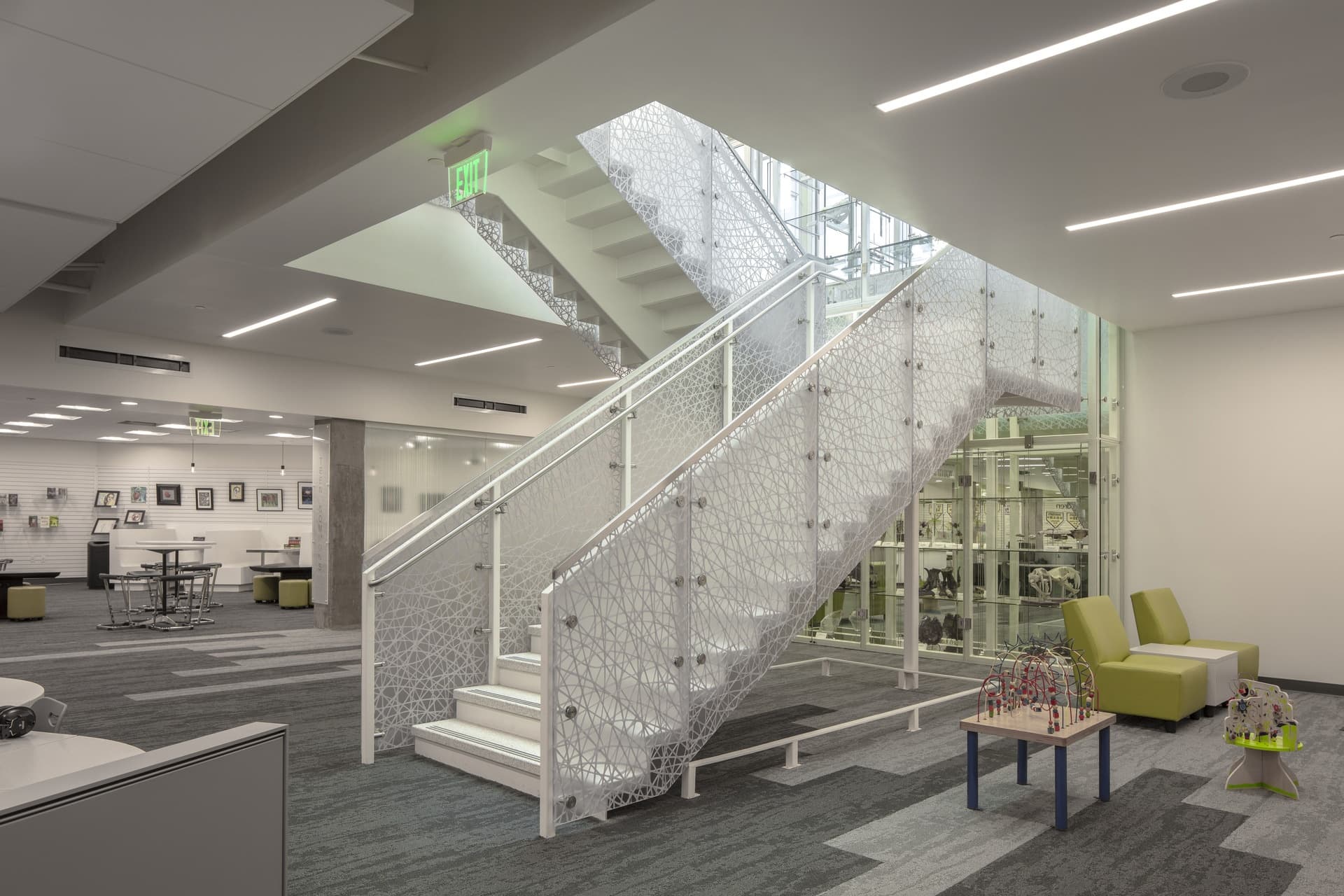
Designed to promote active aging, the Midvale Senior Center provides a new model in the design of senior centers. This LEED-Gold certified space responds to the evolving needs of a new generation of seniors by intentionally welcoming baby boomers without alienating the older senior population. Anchoring Downton Midvale, the Center's main entrance, café and recreation spaces actively engage the historic Main Street. Our design balances contextual considerations with a low-profile building form and a siloed staircase that references a nearby historic building.
The building's materiality purposely ties into the history of the area through elements such as the locally-sourced brick, which complements the historic facades along Main Street. The use of copper celebrates the time when Midvale served as a historic center of the once-booming mining industry. The interior incorporates historic photography and signage (including the BPOE sign from Midvale Eagles Club) as well as a site-specific piece of public art celebrating the nearby Bingham Mine anchoring the main lobby.
Ogden Nature Center - Picnic Grove
Ogden, UT
- Catalog No.3341
- ClientOgden Nature Center
- Completion2023
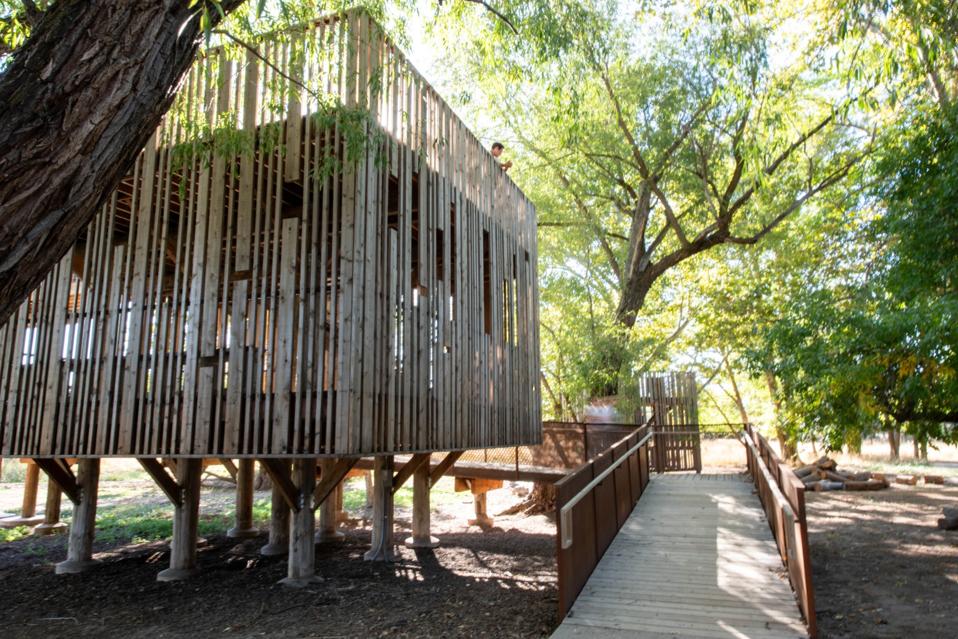
The Dumke Picnic Grove provides an updated woodland gathering space that seamlessly connects visitors with the Ogden Nature Center's 152-acre habitat. EDA's comprehensive renovation of the space included two refurbished treehouses anchoring the site featuring reclaimed Douglas fir poles from Union Pacific's historic Lucin Cutoff trestle over the Great Salt Lake. Our team developed the new event pavilion with food prep space, restrooms and covered serving area that defines the west edge of the extensively relandscaped zone. Other outcomes of our design is a creek-view terrace, fire pit and varied seating areas for camps, parties and meetings. Serving as an outdoor classroom, event venue and birdwatching location, the Grove exemplifies sustainable design that honors both natural heritage and community needs.
Utah Veterans Memorial
West Valley City
- Catalog No.2708
- ClientWest Valley City
- Area8,000 SF
- Completion2022
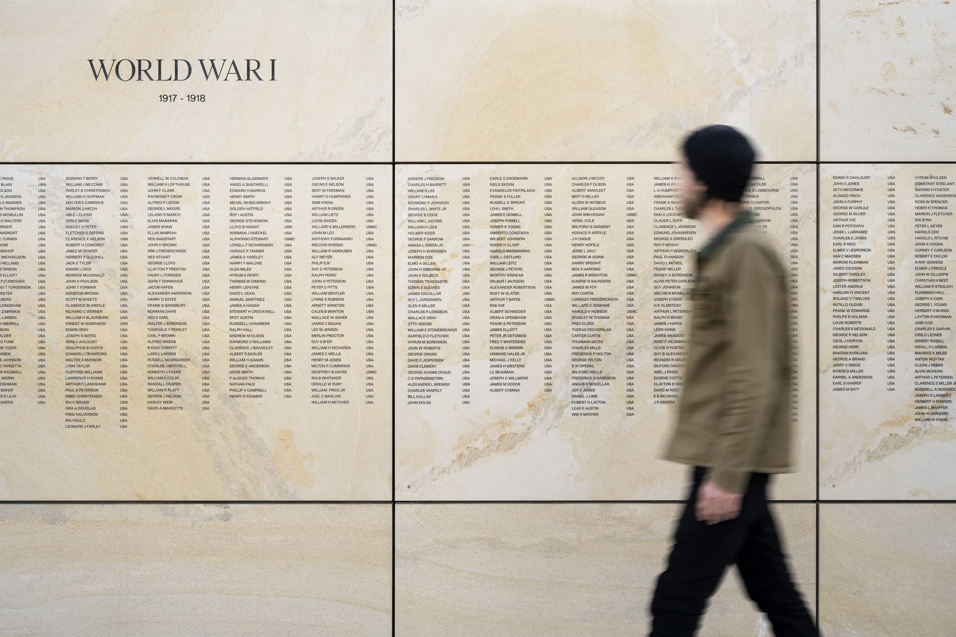
Honoring Utah's fallen heroes, the Utah Veterans Memorial invites solemn introspection and connection within a respectful space to remember and reflect upon those memorialized. Sited on just over three acres, its only two entrances guide visitors into the plaza facing east, allowing the prominent Wasatch Front in the distance to set the tone upon entry – as if the mountains are paying homage to those memorialized within. Upon entry, visitors find themselves in a subdued yet fitting space. The placement of the names scribed into the wall’s east side, eternally facing the mountains, allow them to be discovered after entry upon turning towards the wall. Arranged chronologically by war and dating back to World War I the names, listed in a random order, form a single continuous roll call of those united in their common sacrifice. At the center of the plaza, two quartzitic sandstone monoliths quarried from nearby Brown's Canyon align to present an outline of Utah. The facing sides of each slab are carved to reflect Zebra Slot Canyon, with a relief at the base representing the canyon’s runoff wash.
Wasatch County Administrative Building
Heber, UT
- Catalog No.3482
- ClientWasatch County
- Area62,000 SF
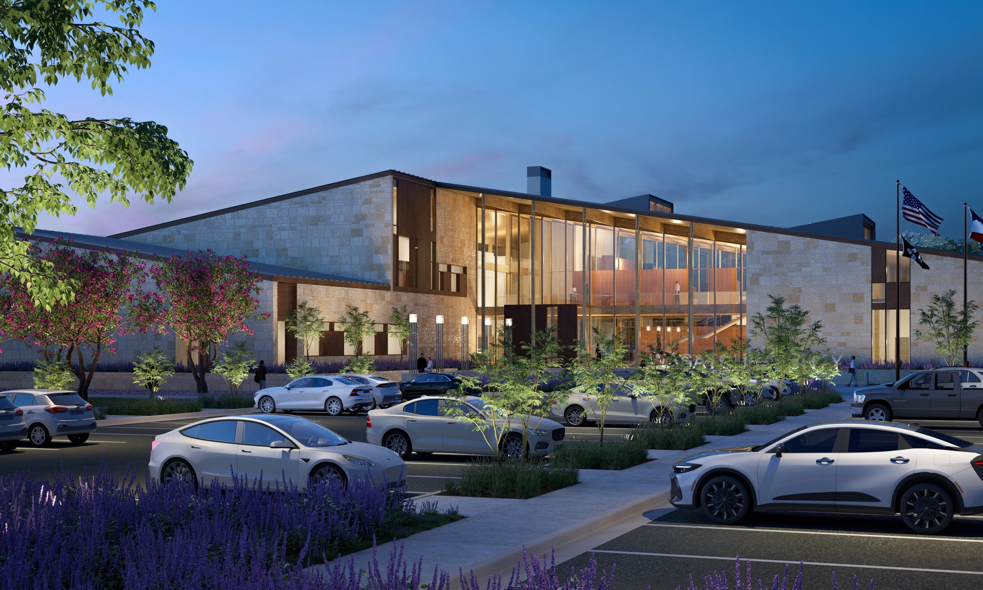
Currently in design, Wasatch County’s new Administration Building brings departments and the public together in a civic space rooted in clarity, sustainability and connection. The purpose-built facility consolidates County services and the Council Chambers with intuitive wayfinding and thoughtful adjacencies that streamline public access while supporting staff collaboration. Warm materials, natural light and distinct circulation paths elevate the visitor experience. Designed to meet the AIA 2030 Challenge, the building features a Mass Timber structure, high-performance envelope and energy-efficient ground source heat pump system -- a future-ready design that reflects Wasatch County’s commitment to service and stewardship.
Valley Recreation / Community Center Study
Eden
- Catalog No.3377
- ClientValley Recreation District, Silver and Gold Senior Center, Jerome County
- Area29,400 SF
- Completion2023
To evaluate the feasibility of developing a new Valley Recreation and Community Center centered between the two communities it intends to serve we conducted the community survey to gauge interest and support. Our conceptual designs reflected spaces for the Center’s diverse needs including flexible, multiuse spaces.
Performing Arts Center Feasibility Study
West Valley City
- Catalog No.3407
- ClientWest Valley City
- Area33,100 SF
- Completion2018
Our study explored opportunities to improve the West Valley City Theater building's ability to provide a state-of-the-art performing arts center for the community of West Valley City. Ideas generated by the study included redefining the image of the facility through spaces such as a large modern, iconic and transparent lobby. We also reviewed relocating the box office, retrofitting the existing theatre-in-the-round, providing a new black box/multipurpose event space and site improvements such as new landscaping, pedestrian accessways, vehicle movement areas and parking.
West Valley City Library Feasibility Study
West Valley City
- Catalog No.3406
- ClientSalt Lake County Public Library, West Valley City
- Area20,000 SF
- Completion2019
We explored the opportunity to develop an unconventional site for a potential future library site: a dense, interior retail and storage space at the Valley Fair Mall. Our proposed solution lightens the space by introducing a large, central outdoor courtyard which provides daylight and 'views' into all of the programmatic elements including the children's and teen's areas, makerspace, computers and main library stacks. For the exterior our team explored the ability to convert a vast parking area into a public green space to serve as a welcoming gesture toward patrons coming into the library. At the interior mall entrance, we introduced a cafe as a retail space to draw patrons from inside the mall.
John W. Gallivan Plaza Center and Ice Rink
Salt Lake City
- Catalog No.2186
- ClientRedevelopment Agency (RDA) of Salt Lake City
- Area21,584 SF
- Completion2014
- Awards
- 2012 AIA Utah Merit Award
- 2012 IIDA - Intermountain BEST - Play
- 2012 Downtown Alliance Achievement Award
- Certifications
- LEED Gold
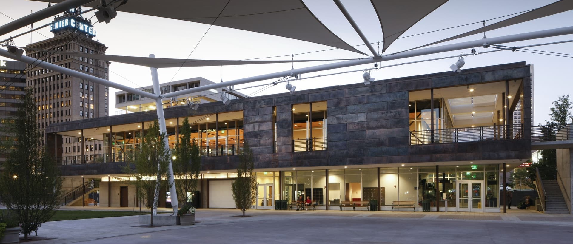
As Salt Lake City’s living room, John W. Gallivan Plaza supports a wide range of activities and events, including the Twilight Concert Series, winter ice skating, and arts and food festivals. WE have developed a number of design solutions at Gallivan over the course of nearly three decades. Among these are a set of retail shops along Gallivan Avenue, the current amphitheater and ice sheet, and the 21,000 square foot event center/ice support building that won a 2012 AIA Utah Merit Award.
The event space represents the capstone of the Gallivan Center master plan. Built on top the existing Gallivan Center parking, the event space creates a sense of enclosure for the park. Composed of a steel frame, copper paneling, and cast-in-place and pre-cast concrete, it presents a warm and enduring face while honoring the region's long mining history. The building’s lower floor provides support for the ice sheet and the amphitheater. Ringed by balconies its second story expands the center’s conference and special event capabilities. A planted roof positively contributes to the park’s aesthetics when viewed from surrounding buildings.
Summit County Health Services
Park City
- Catalog No.1192
- ClientSummit County
- Area25,000 SF
- Completion2007
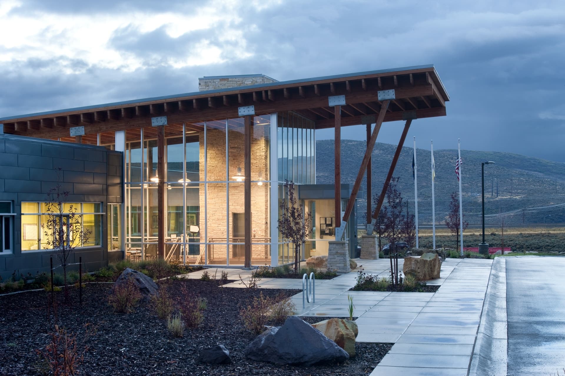
We approached the design with the philosophy that those working to promote community health should experience a healthy work environment themselves. Our “healthy building” maximizes natural daylight in working spaces while ensuring energy efficiency through passive solar orientation, draft-resistant construction and a geothermal heat pump. The "100 Mile Building" is built from locally sourced materials such as Browns Canyon stone, local Zinc panels and local timber. The Center houses the County Health Department and provides space for the People’s Health Clinic - a non-profit organization that offers basic health services to uninsured residents.
Herriman Library
Herriman, UT
- Catalog No.1672
- ClientSalt Lake County
- Area20,302 SF
- Completion2010
- Certifications
- LEED Gold
Designed with people of all ages and interests in mind, we applied age-specific strategies for children (low shelving with engaging end-cap activities) and teens (unique seating to facilitate fun gatherings). Recognizing the way we read and access information is changing, we developed a flexible design, providing the community an asset for digital information connectivity and multi-media creativity. Augmenting daily library programming the multipurpose room with separate entrance allows after-hours community uses.
The building's form and orientation adhere to design concepts developed to minimize energy usage and promote the use of natural daylighting techniques. When it opened, the LEED Gold Library boasted the lowest Energy Use Index (EUI) of the hundreds of buildings in Salt Lake County’s repertoire. EDA utilized an extensive process for building envelope optimization that included energy and daylight modeling to inform the size and placement of openings to achieve both high performance and high-quality daylighting and views. The facility is part of a larger area that includes a recreation center (also designed by EDA) and the City Hall. Its positioning works with the surrounding environment to make an inspiring civic campus.
Draper Senior Center
Draper
- Catalog No.1953
- ClientSalt Lake County
- Area21,890 SF
- Completion2012
- Certifications
- LEED Gold
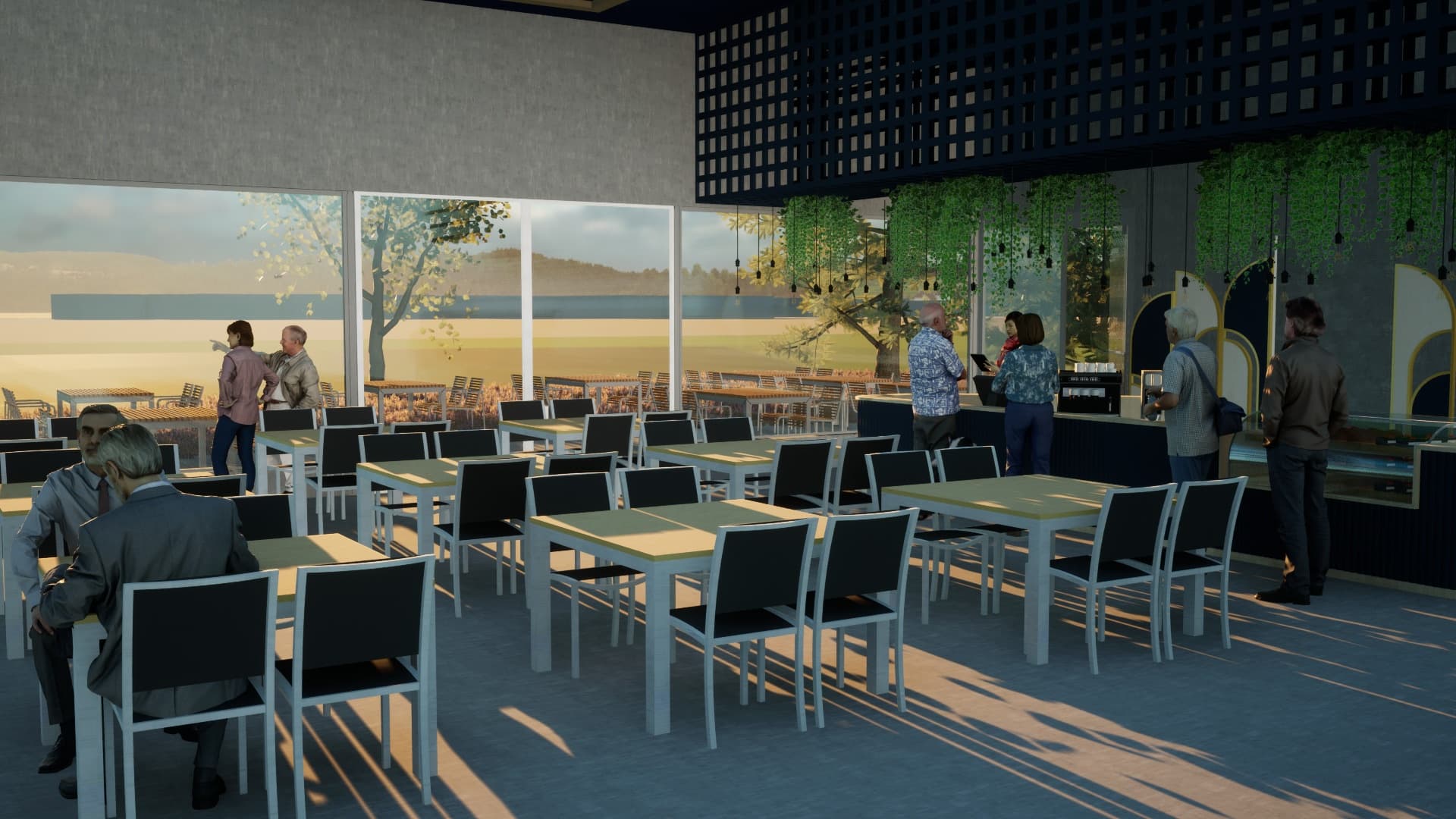
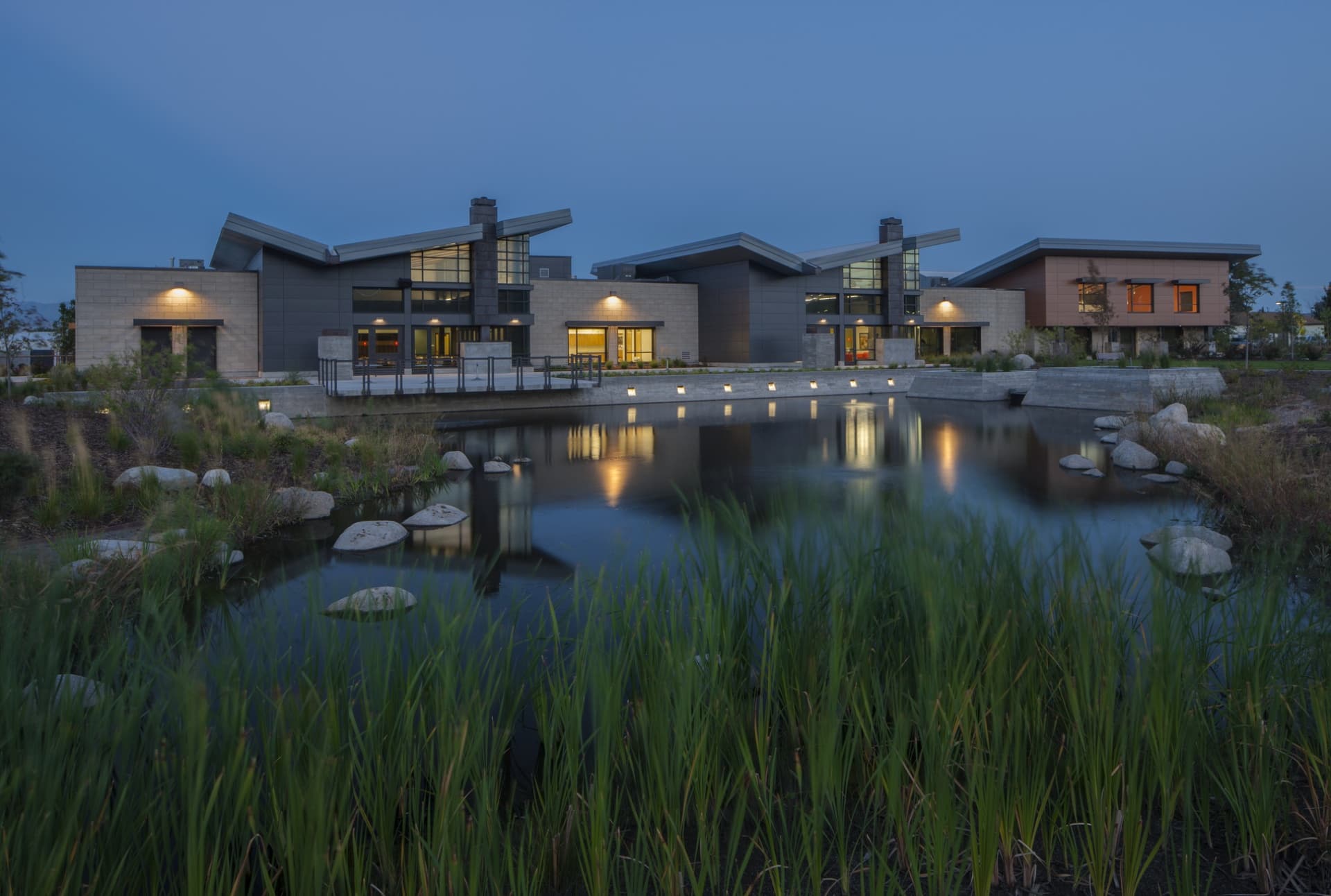
Drawing inspiration from modern hospitality the open, light-filled design creates an welcoming and active environment to meet the needs of a new generation of seniors. Generous usage of windows and skylights spread natural light throughout the building, while the inclusion of South Willow Creek, redirected to form a picturesque pond, enhances the site's natural charm. A LEED Gold certified building, the Draper Senior Center is not only environmentally conscious but strategically situated alongside the Draper Library and the TRAX light rail system. Its massing is thoughtfully orchestrated to harmonize with the surrounding context, ensuring that its scale complements neighboring structures despite its larger footprint.
Weber County Library North Branch
Ogden
- Catalog No.2567
- ClientWeber County Library System
- Area21,625 SF
- Completion2019
Following a successful bond campaign, our process to identify opportunities for improvements involved a a rigorous evaluation of systems and resources. Our process included engaging in collaborative community and user input to uncover everyday users needs to arrive at consensus between the County and the City of North Ogden. The resulting solution doubled the library's program space while providing an updated front entry and new rear entry and façade.
The new spaces within opens up to and welcomes constituents into a an entirely refreshed and modern presence.
Weber County Main Library Historic Restoration
Ogden
- Catalog No.2135
- ClientWeber County Library System
- Area55,680 SF
- Completion2019
- Awards
- 2019 Library Journal Magazine New Landmark Libraries - Honorable Mention
- 2019 Preservation Utah Heritage Award
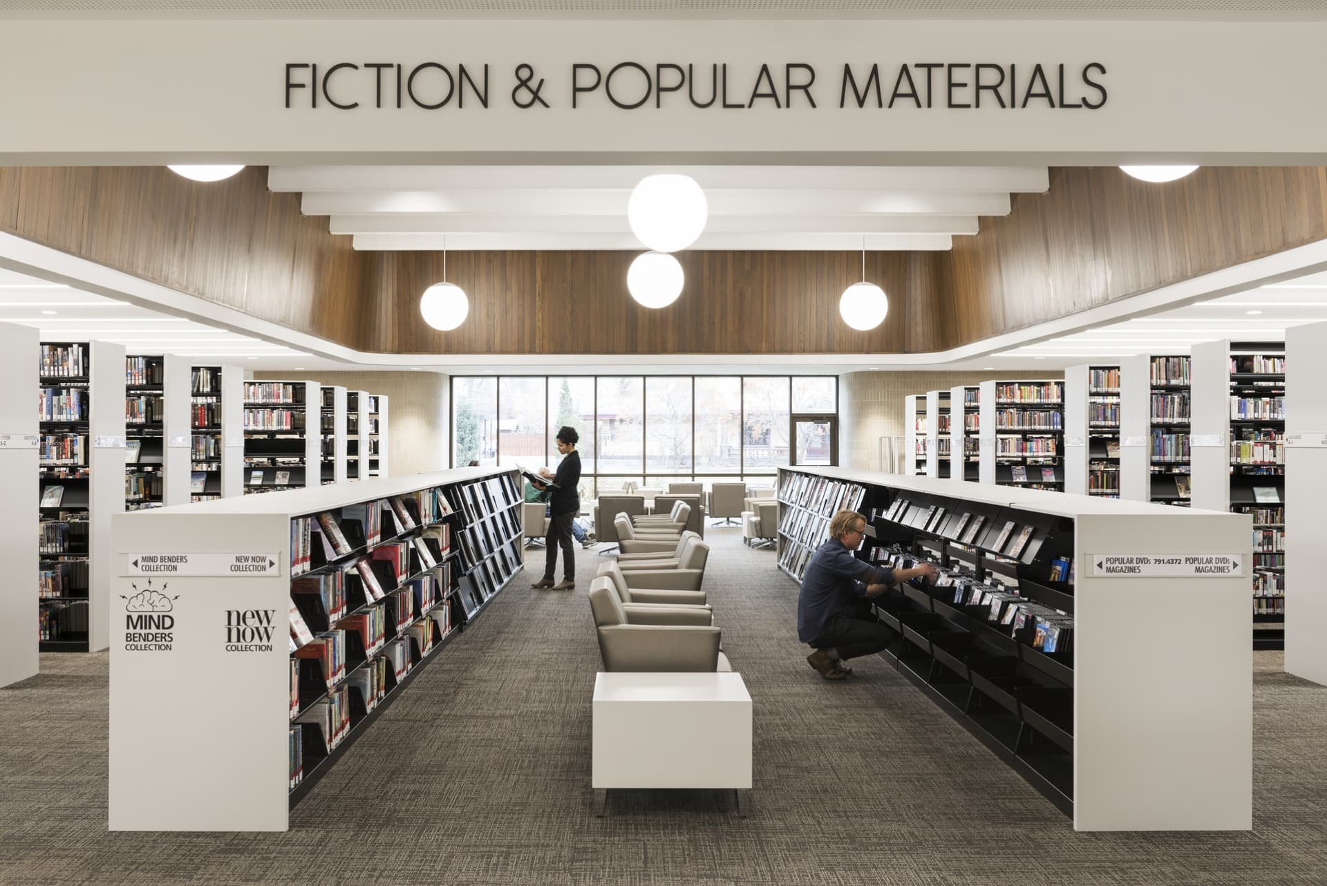
Seamlessly marrying the contrasting needs of a library in the digital age and the preservation of a gem of mid-century modernist architecture, this transformation updated the library while positioning it for inclusion on the National Register of Historic Places. Recognizing its architectural and community significance, we engaged extensively with Ogden's residents, leaders and library staff throughout the design process. The resulting design led to a thirty percent increase in publicly accessible spaces and modern technology and building systems. The dual-focused the design efforts developed a facility that functions as a repository of books and provides community access to multi-media resources.
In addition to the traditional book stacks and reading areas, the renovated library features interdisciplinary spaces to house dedicated science, technology, engineering, arts and math (STEAM) education-focused spaces. Developed due to needs expressed by the client and community, these community spaces include maker spaces for functions such as film making, general arts studio and small theaters to accommodate readings and music recitals and performances.
As part of preserving the historical integrity, all the original walnut paneling was preserved; most of which was protected in place and carefully refinished. The special collections room in the basement, outfitted with rose wood paneling, was protected through abatement, demolition and new construction phases. The design introduced a new plaza connecting the library to its natural surroundings and incorporated contextually sensitive architectural elements such as new entries and windows to foster community engagement.
Farmington City Hall
Farmington
- Catalog No.1676
- ClientFarmington City
- Area21,267 SF
- Completion2010
- Awards
- 2010 Mountain States Construction Gold Award - Intermountain Best
We engaged the community to develop a city hall that - rather than having a modern design - reflects the unique culture and heritage of the City's historic core and Main Street. Our solution provides a contextual design response, embodying the character of the surrounding Farmington neighborhood. To scale down the overall building mass, the facility is comprised of four discrete building wings joined by a transparent atrium. Three of the wings invoke the historic frame homes along Main Street, while the fourth and principal wing is a reference to Farmington’s original red-brick city hall. Material choices and design reference Farmington’s heritage and historic architecture without being overly representational or literal. Three of the wings utilize pitched roofs, clapboard wood siding and wood windows to reflect the historic frame homes along Farmington’s Main Street. The brick-clad fourth and principal wing, evokes Farmington’s existing original brick city hall. Other materials on this portion of the building include red sandstone and gneiss granite quarried locally. The difference in materials also serve as wayfinding prompts. The glass atrium denotes the public entrance and lobby with pre-function spaces and connection to City departments, whose offices and support spaces are housed within the white wings. The principal wing’s brick points the way to the city council chambers and community room.
Salt Palace Expansion and Renovation
Salt Lake City
- Catalog No.0947
- ClientSalt Lake County
- Area272,197 SF
- Completion2006
- Awards
- 2006 Intermountain Contractor Best of 2006
- 2006 Intermountain Contractor Best Green Building Project
- Certifications
- LEED Silver
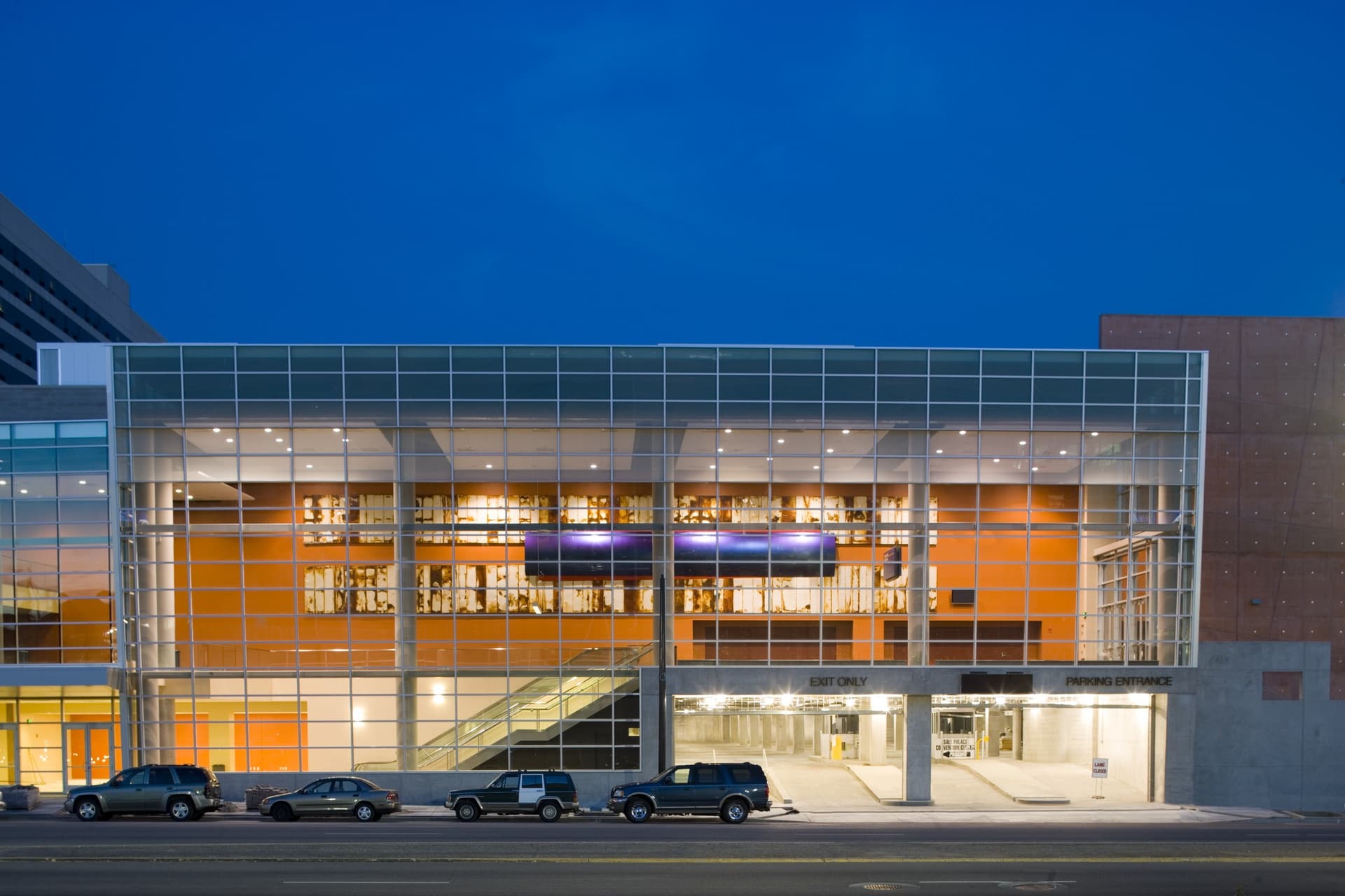
Our design served as a catalyst for Salt Lake City’s position as a destination for national trade shows and conferences.
The centerpiece of our design is a the west entrance – an open and airy pre-function lobby space opening onto Vivint Plaza. Providing an additional 250,000 SF of exhibition, meeting room space and two levels of underground parking served to meet the County's goal of retaining its base of growing convention clientele and attracting larger conventions to the center.
LEED Silver, the first LEED Certified project in Salt Lake County, the facility set a standard for public project sustainability in the City and County. Our solution included the largest solar-power lighting system in Utah installed up to that time and a 100% storm water retention system.
Salt Lake City Main Public Library
Salt Lake City
- Catalog No.0051
- ClientSalt Lake City Public Library System
- Area104,986 SF
- Completion1964
- Awards
- 1966 AIA National Merit Award
- 1965 AIA Utah Honor Award
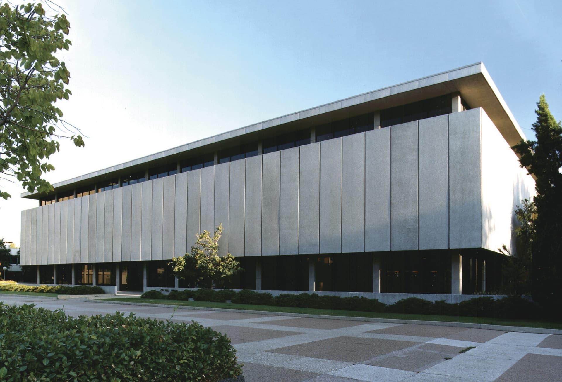
EDA’s design for the Main Public Library introduced New Formalism to the region. Located opposite City Hall, the library complemented its neighbor’s ornate architecture while symbolizing the city’s future aspirations. The library was more than just a building; it was a cultural institution designed to endure. It housed over 700,000 volumes, a fine arts department, a rare books collection, a 500-seat auditorium and parking for staff and visitors. The use of locally sourced materials, such as precast concrete panels, ensured durability and thermal efficiency. The building’s distinctive feature, the integrated sculpture "Songs of Innocence" by Jo Roeper, highlighted the entrance, representing an early collaboration of modern art and architecture in Utah. A staple in the community, upon the the construction of a replacement library the citizens rallied to ensure the structure not be demolished, resulting in it housing the The Leonardo Museum,
Antelope Island State Park Visitors Center
Syracuse
- Catalog No.0536
- ClientUtah Dept. of Natural Resources
- Area15,200 SF
- Completion1995
- Awards
- 1997 AIA Utah Honor Award
- 1997 AIA Western Mountain Region Merit Award
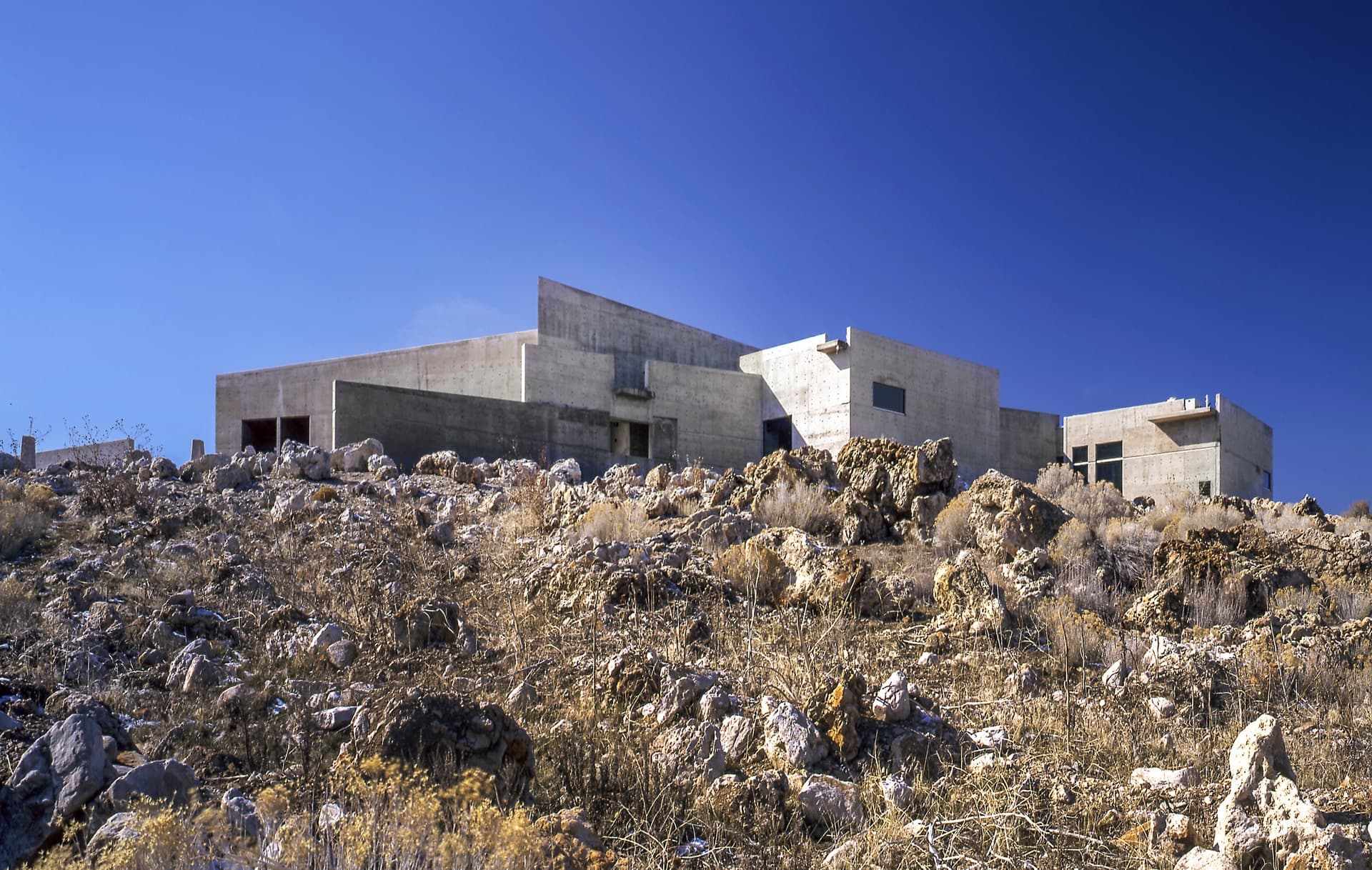
Serving as the gateway to this unique 30,000-acre state park on the shores of the Great Salt Lake, it introduces and transitions visitors to the lake and the island. The timeless award-winning design, rooted in the concepts of regional modernism, follows the northern ridge of the island, complementing and emphasizing the power of the natural landscape. We used site topography to anchor the building, creating a modernist building which integrates itself into the local landscape. Comprised of cast-in-place architectural concrete and salvaged timbers, the center is evocative of the island’s sparse flora and rocky geology. The exhibit area includes a central room running the entire length of the facility as well as a multipurpose room used for films and lectures. Both have carefully framed views of the island Great Salt Lake and mainland. The roof frame for the central portion of the structure employs exposed timbers salvaged from the 12-mile railroad trestle, which spanned the northern arm of the Great Salt Lake as part of the Southern Pacific Railroad’s Lucin Cutoff. The recycled redwood and fir timbering adds to the heft and feel of the visitor center, as do the exposed infrastructure, the highly articulated joints, and smooth concrete slabs. Throughout the building there is an easy juxtaposition of natural and artificial materials.
