Midvale Senior Center
Midvale
- Catalog No.2615
- ClientSalt Lake County
- Area20,564 SF
- Completion2016
- Awards
- 2019 AIA National Design for Aging Review - Award of Merit
- 2018 AIA Western Mountain Region Design Excellence Citation
- 2018 ACEC Honor Award
- 2017 AIA Utah Urban Design Merit Award
- 2016 IIDA - Intermountain BEST Award - Give: Healthcare, Senior Living
- 2015 AIA Utah Honor Award
- 2015 Utah Design and Construction Most Outstanding Public Project (Under 10M)
- Certifications
- LEED Gold
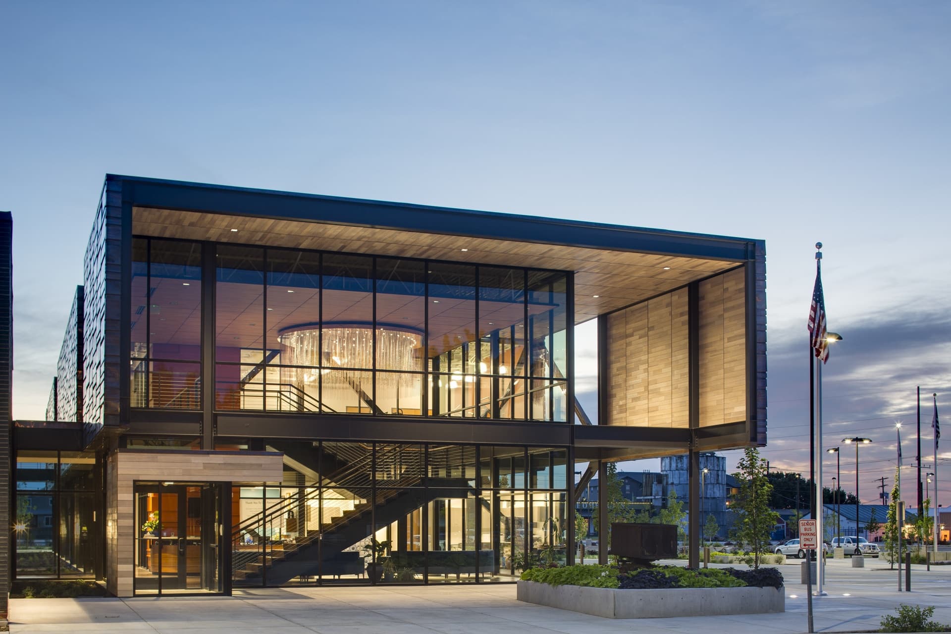
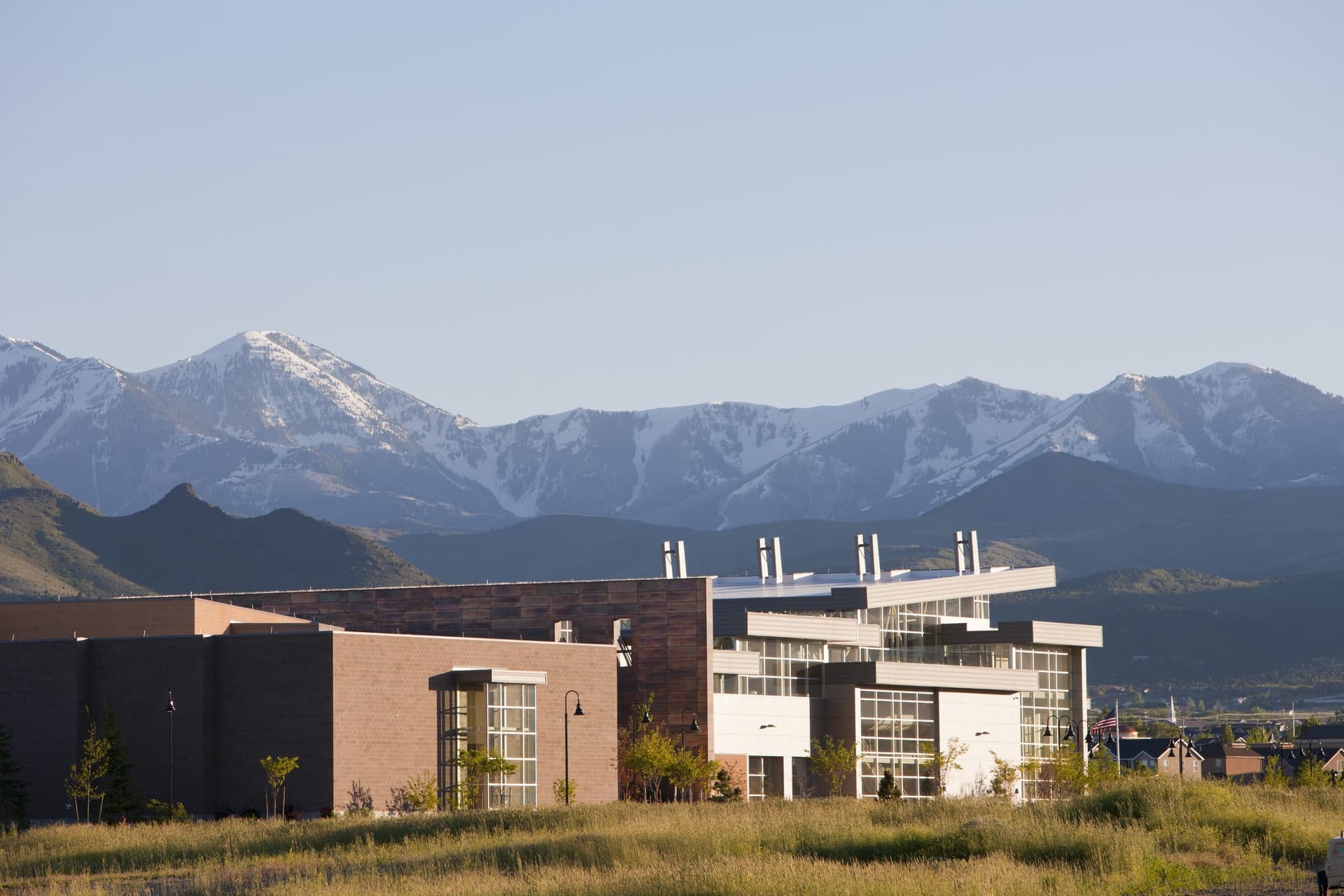
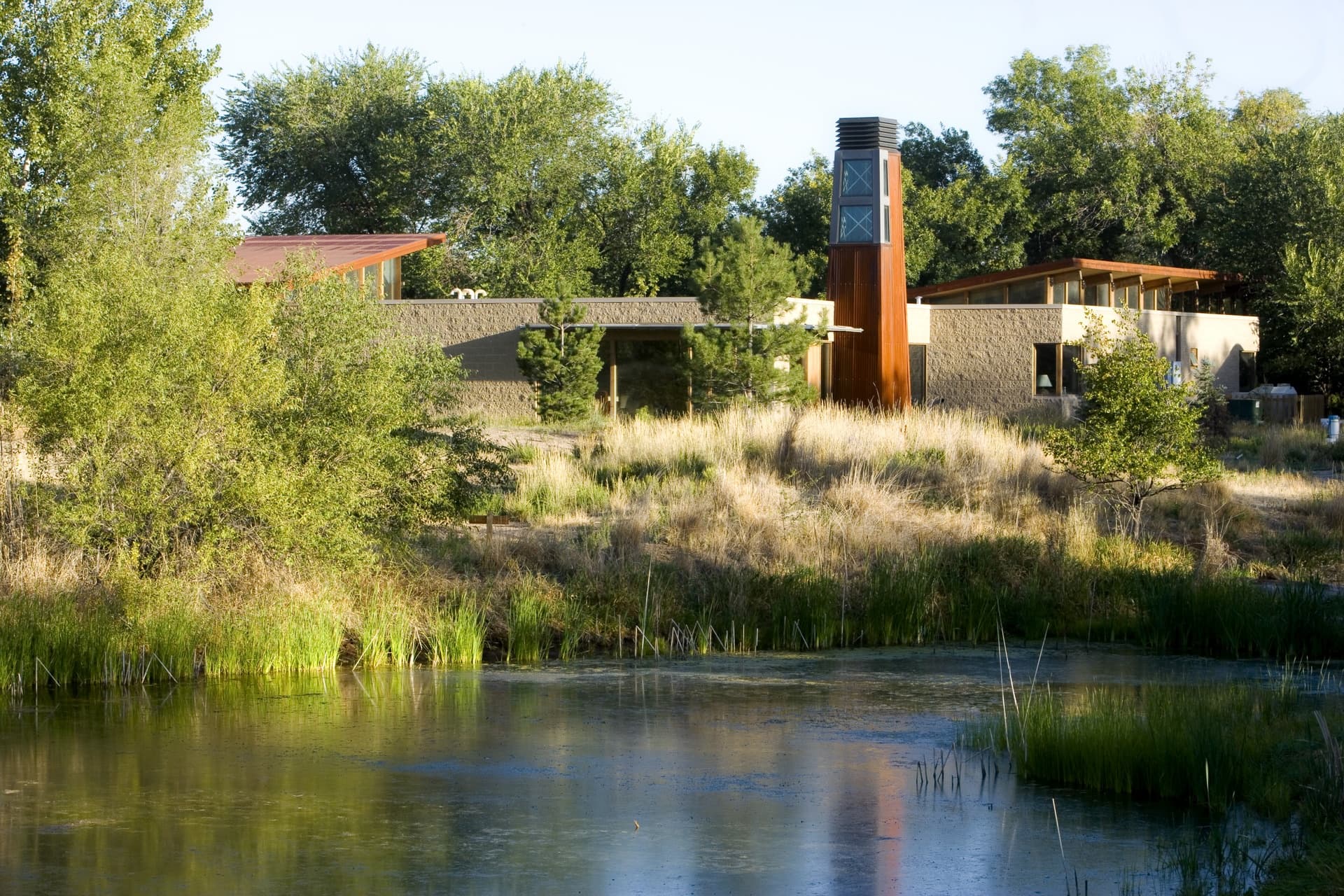
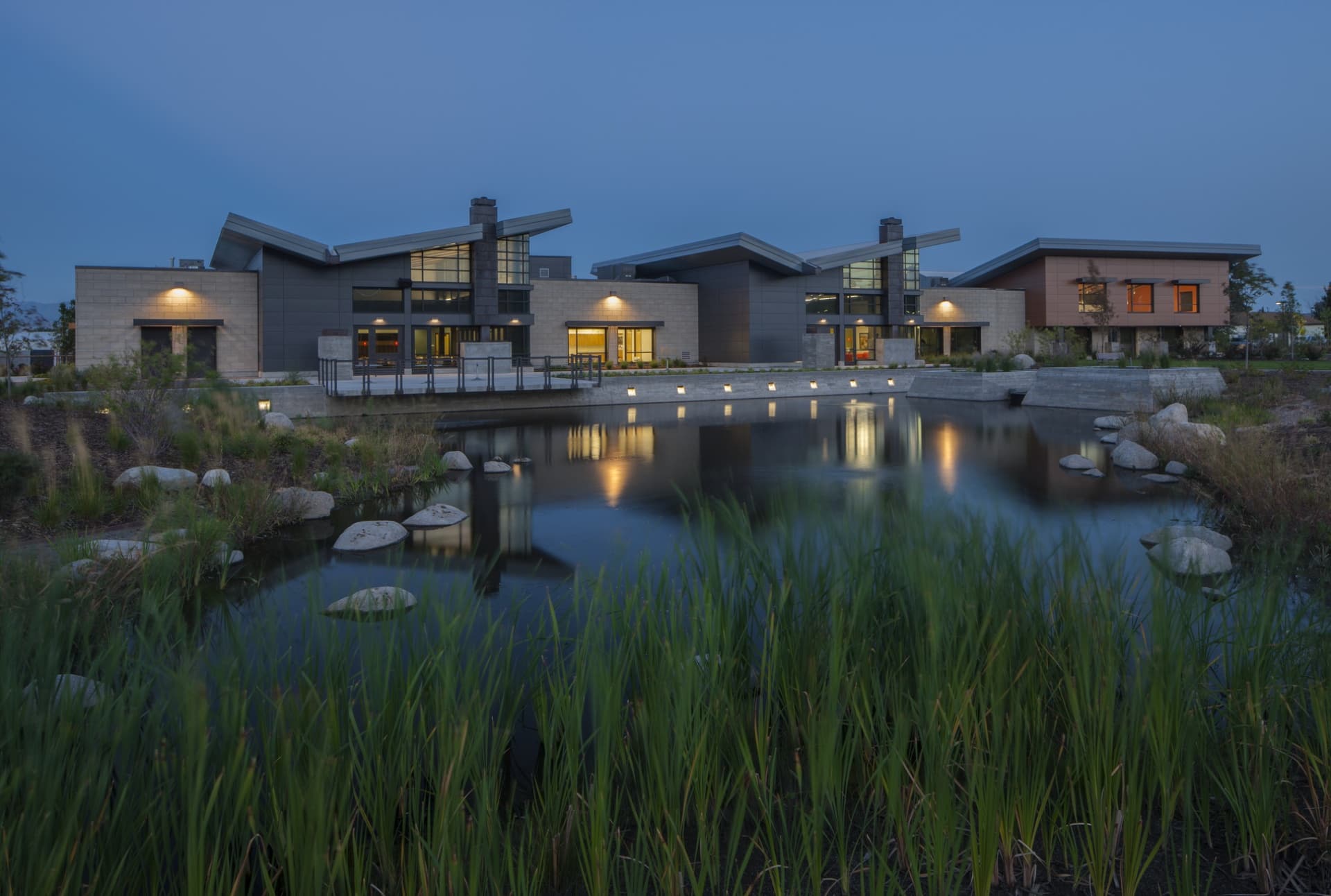
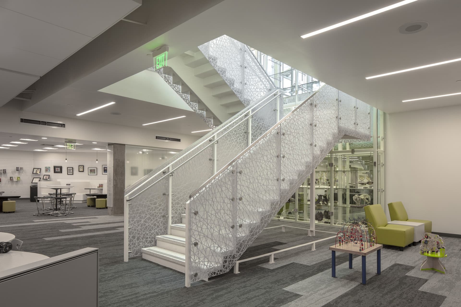
Designed to promote active aging, the Midvale Senior Center provides a new model in the design of senior centers. This LEED-Gold certified space responds to the evolving needs of a new generation of seniors by intentionally welcoming baby boomers without alienating the older senior population. Anchoring Downton Midvale, the Center's main entrance, café and recreation spaces actively engage the historic Main Street. Our design balances contextual considerations with a low-profile building form and a siloed staircase that references a nearby historic building.
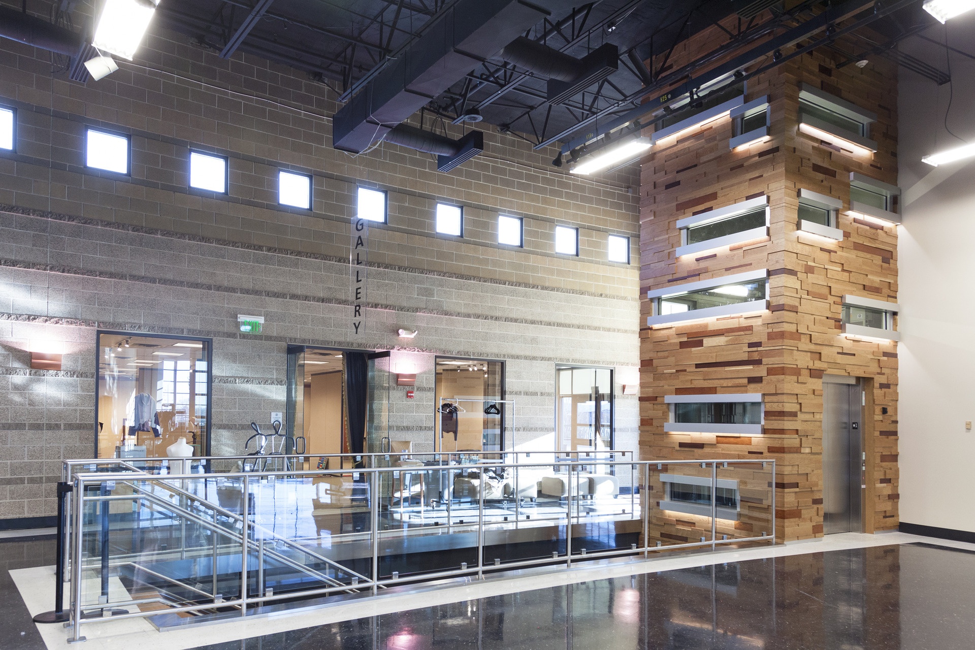
The building's materiality purposely ties into the history of the area through elements such as the locally-sourced brick, which complements the historic facades along Main Street. The use of copper celebrates the time when Midvale served as a historic center of the once-booming mining industry. The interior incorporates historic photography and signage (including the BPOE sign from Midvale Eagles Club) as well as a site-specific piece of public art celebrating the nearby Bingham Mine anchoring the main lobby.
LS Skaggs Applied Science Building at the Crocker Science Complex
Salt Lake City
- Catalog No.3120
- ClientUniversity of Utah
- Area140,000 SF
- Completion2025
- Awards
- 2025 Most Outstanding Higher Education Project, Utah Construction + Design Magazine
- Certifications
- Pending Certification
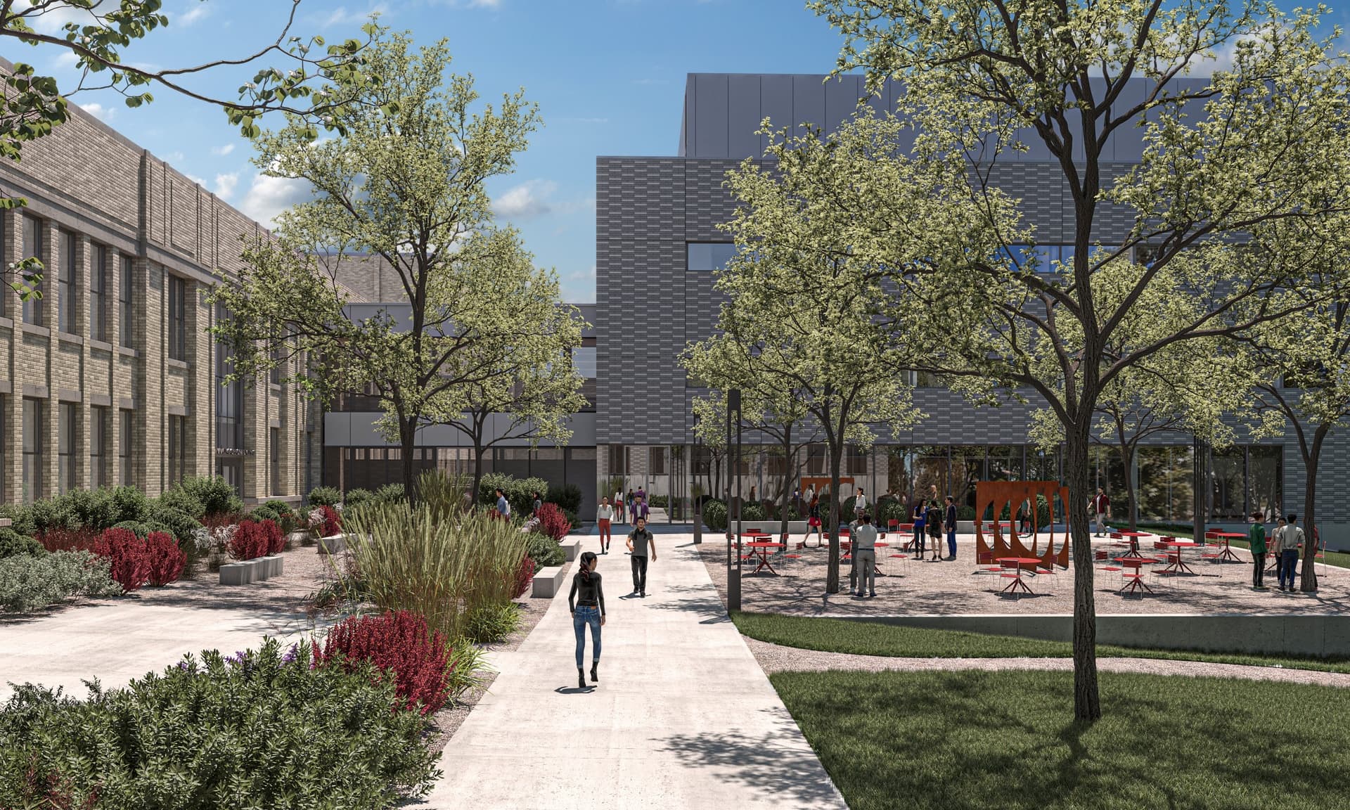
The LS Skaggs Applied Science Building, part of the Crocker Sciences Complex, is the new cornerstone of the University of Utah’s educational and research mission. It embodies a commitment to excellence, innovation and a bright future for the University of Utah’s academic and research pursuits. Student success is supported by a high-quality classroom experience, training in modern scientific and technological methods and a signature research experience for each major in the program. With a focus on accommodating the instructional needs of over 5,600 undergraduate and graduate students in STEM courses, the facility combines a thoughtful 40,000+ SF renovation of the historic Stewart Building with a contemporary 100,000+ SF addition.
Sweetwater County Justice Complex
Green River
- Catalog No.2574
- ClientSweetwater County
- Area55,474 SF
- Completion2018
- Awards
- 2020 AIA National Justice Facilities Review
- 2020 IIDA - Intermountain BEST - Serve
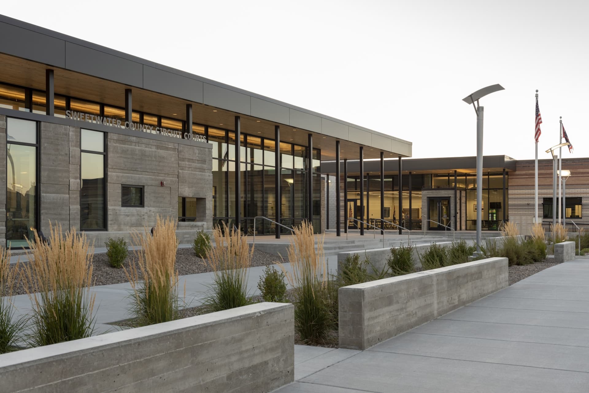
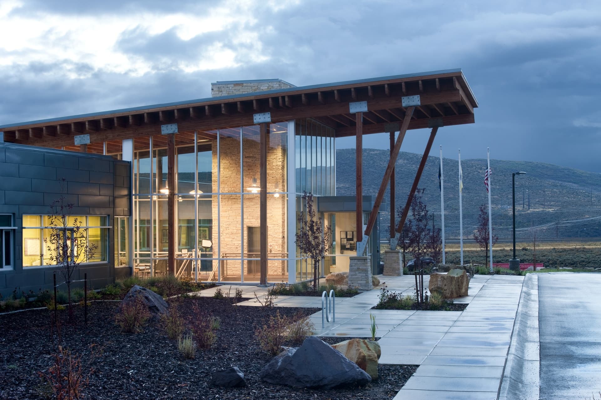
Fulfilling current and long-term County needs, we developed a Judicial Facilities Needs Assessment and a Judicial Facilities Master Development Plan for Sweetwater County. The resulting Phase I Justice Center co-locates and centralizes several public safety and justice agencies in one place, significantly improving the efficiency, convenience, safety and security of the County’s justice services while creating a distinct civic landmark.
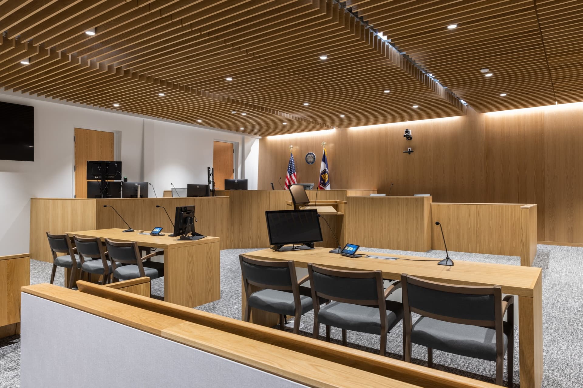
Our design reinforces Sweetwater's community identity by drawing on the unique geology, local resources and cultural history of Southwest Wyoming. Through its locally sourced materials and native vegetation, the building embraces its context and the beauty of the Green River canyon. Bricks of different hues echo the striations of the surrounding buttes, while reused snow fence boards lend concrete walls a rustic texture. Deep reveals in the walls refer to the ongoing process of erosion found throughout the landscape. Inside the courtrooms, beetle-kill pine panels and millwork orient focus on the judge, witness stand and lectern.
Crocker Science Center at the Crocker Science Complex
Salt Lake City
- Catalog No.2566
- ClientUniversity of Utah
- Area123,500 SF
- Completion2019
- Awards
- 2018 AIA Utah Honor Award
- 2018 ACEC Grand Conceptor Award
- 2018 Preservation Utah Honor Award
- 2017 Utah Design and Construction Most Outstanding Project - Renovation/Restoration, Large
- Certifications
- LEED Silver
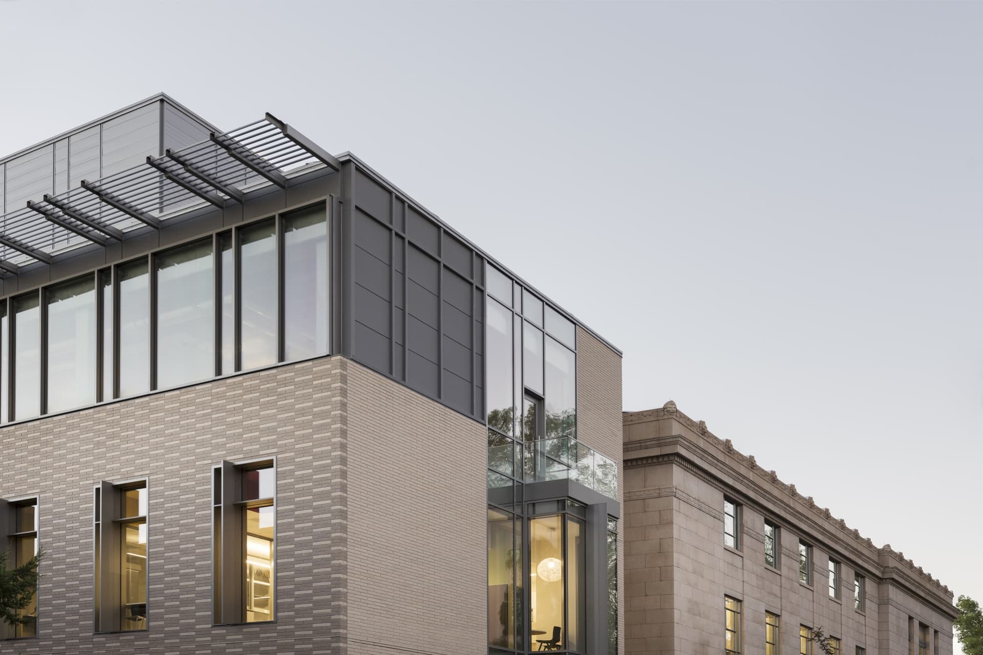
Located on the southwest corner of the University of Utah’s historic Presidents Circle, the Crocker Science Center is the physical gateway to the university proper. EDA worked creatively to design a sensitive adaptation and expansion of the neoclassical library (constructed in 1935) and facilitate an exciting, collaborative environment for cutting-edge knowledge creation.
Our design supports the College of Science’s new science curriculum and delivery system with an innovative project and team-based approach to science pedagogy. Visual openness, blurred lab group boundaries, shared instrumentation and diverse social settings all inspire science and technology transfer, expanding scientific expertise beyond the traditions of respective disciplines. Visual openness, blurred lab group boundaries, shared instrumentation and diverse social settings all serve to inspire science and technology transfer – expanding scientific expertise beyond the traditions of respective disciplines. All teaching laboratories in the building are highly advanced and connected to group discussion areas in order to accommodate a wide-range of teaching styles and activities.
Burch Creek Residence
Ogden
- Catalog No.3031
- ClientPrivate
- Area6,198 SF
- Completion2023
- Awards
- 2024 NAHB Platinum Single-Family Custom, One-of-a-kind Custom Home 4,001-5,000 SF
- 2024 NAHB Home of the Year
- 2024 Best in Region - Mountain
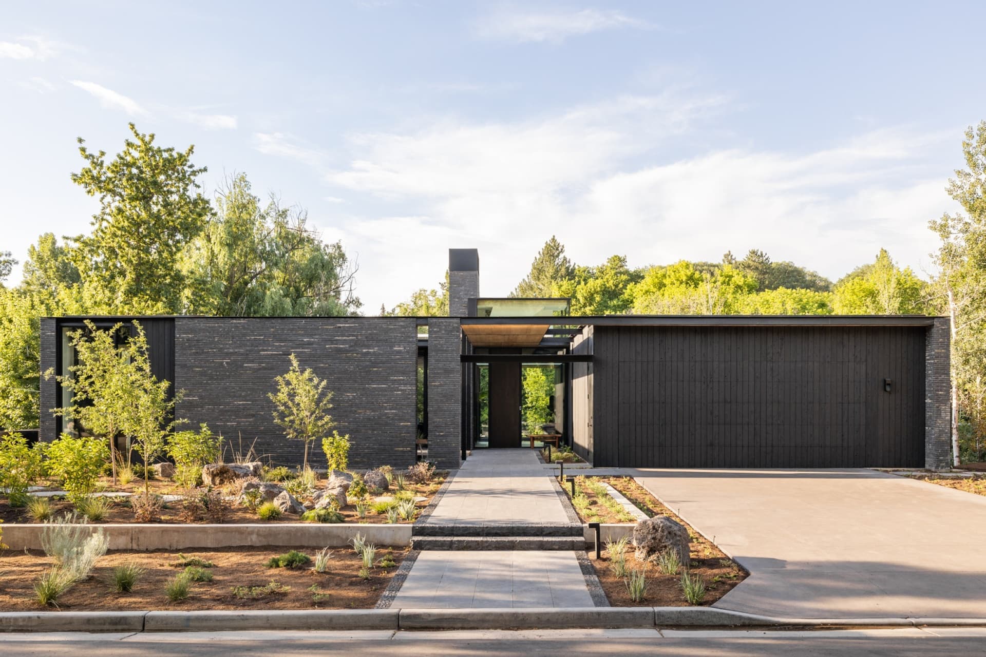
Awarded the National Association of Home Builders 2024 Home of the Year, our design celebrates the beauty of impermanence and imperfection.
The Burch Creek Residence incorporates elements of ‘mono no aware’ (a Japanese aesthetic based in the fleeting and varying beauty of nature) and ‘wabi-sabi’ (an aesthetic embracing concepts of impermanence, imperfection and incompleteness).
Celebrating the movement of water, the home introduces itself as a layered experience. Residents and guests travel through a sequence of carefully composed scales of space and shifting lighting conditions towards the cascading staircase, as each space focuses the eye on the creek bed below.
EDA organized the compact floor plan around a central courtyard to capture both expansive regional and intimate landscaped views. A central “brahmasthan,” inspired by Vedic architecture, acts as the spatial nexus of the home, enhancing both horizontal and vertical connectivity.
Consistent with EDA’s ethos of modernism, the open floor plan is articulated by low cubes for storage or high cubes erupting through the roof’s horizontal plane to define the central hearth and chimney. Within the open plan we used materials such as handmade bricks and artist-designed fixtures to define intimate spaces within the home.
West Valley City Police Department
West Valley City
- Catalog No.3338
- ClientWest Valley City
- Area65,741 SF
- Completion2019
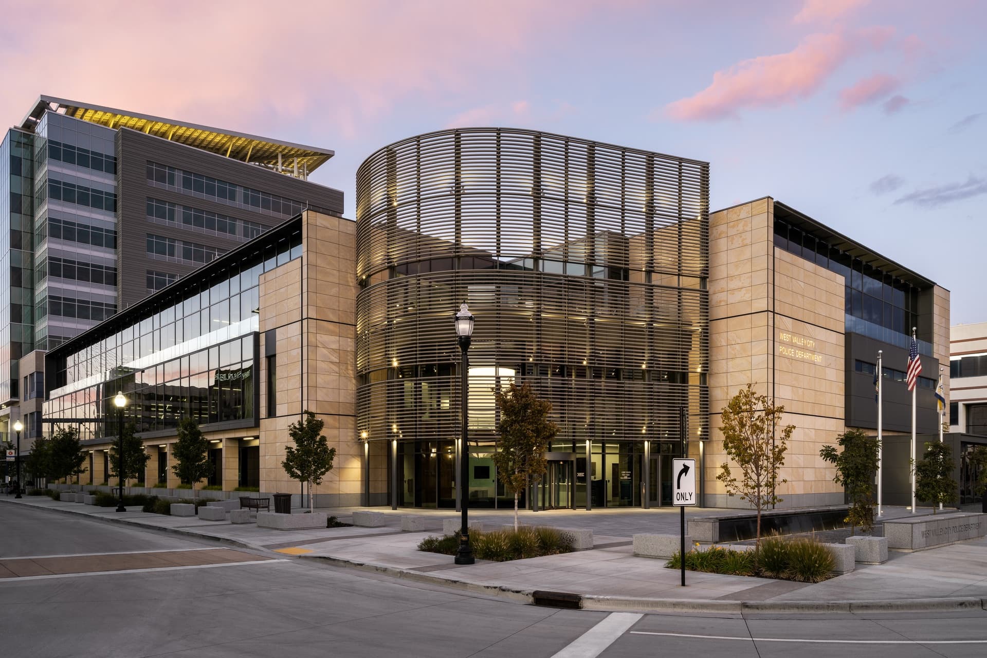
Conforming to the constraints of a compact urban site with consideration to its adjacency to a large multi-modal transit hub, our design team developed a modern, ‘right-sized’ design solution to consolidate uses previously housed in multiple other locations. The Police Department expresses transparency and accountability within the community it serves, while ensuring a safe place for those working and visiting the facility.
Our application of trauma-informed, biophilic design principles includes semi-private quiet spaces for staff on each floor to decompress, have quiet conversations and receive counseling after high-stress events. “Soft” interview rooms give victims a safe, comfortable space to recount events and make statements. Careful consideration of the second and third floor workspace placement and windows maximize natural light penetration while connecting users with place and nature through views of the Wasatch Front and Oquirrh mountains.
Fairbourne Station Office Tower
West Valley City
- Catalog No.3339
- ClientWasatch Properties
- Area243,460 SF
- Completion2020
- Awards
- 2021 ENR Mountain States Best Projects Merit - Office/Retail/Mixed-Use Development
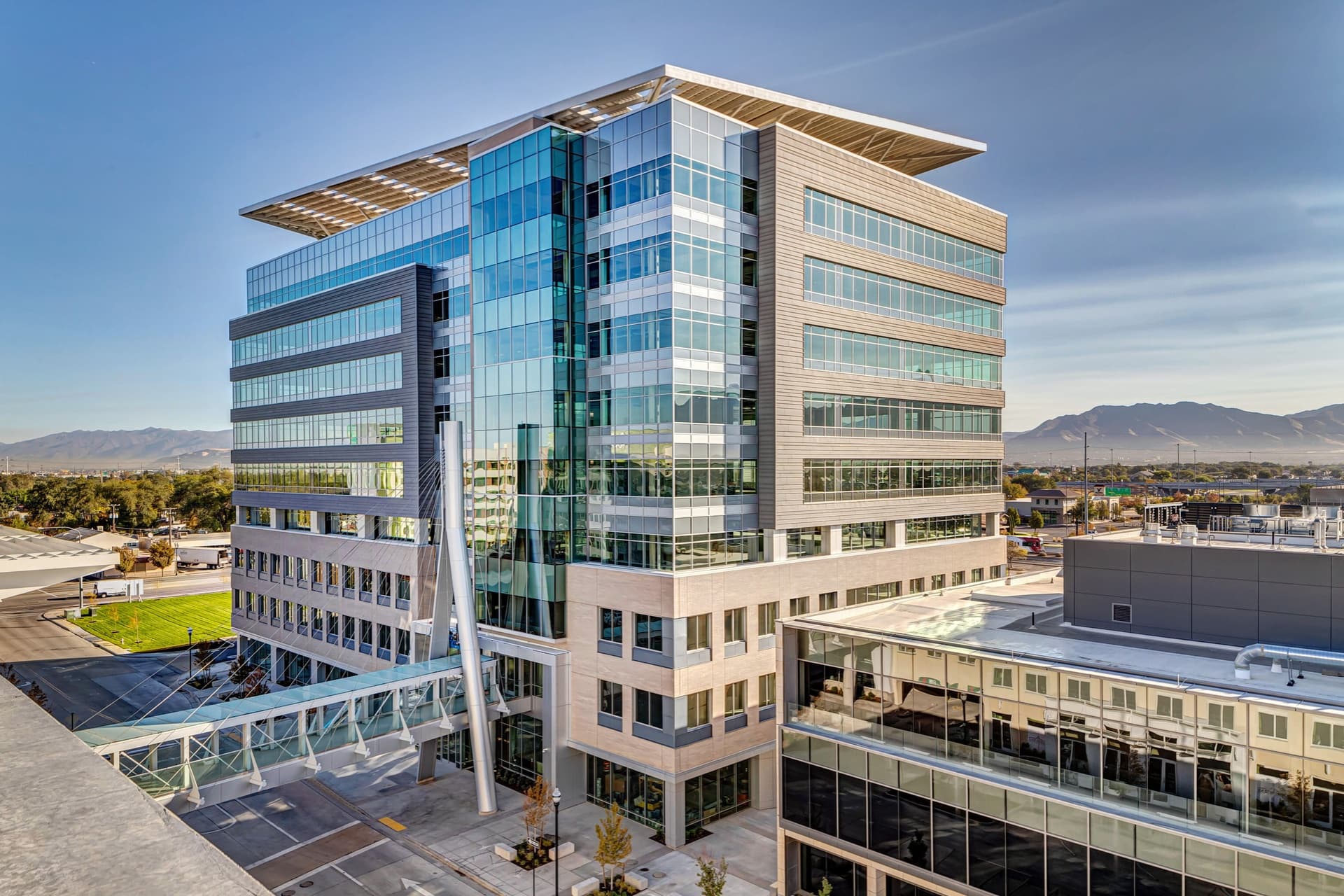
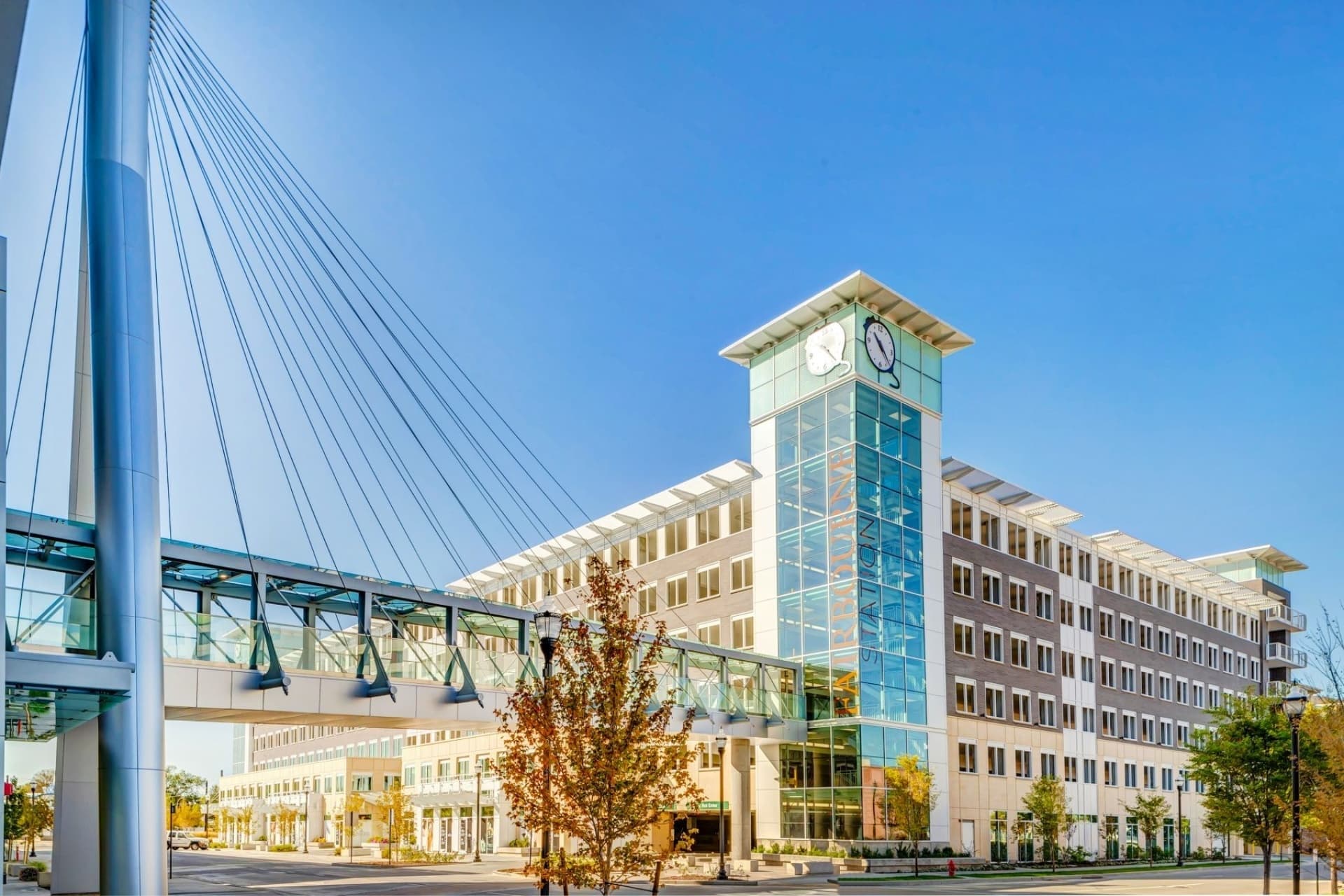
Positioned in the heart of West Valley City’s new urban core, the Fairbourne Station Office Tower is designed to attract local and national businesses due to its customizable tenant spaces and proximity to the airport, highways and mass transit. The tower’s skyline-defining solar array serves as both a striking design feature and functional power source, with 698 panels capable of providing an estimated annual production of 330,000 kWh.
A sleek facade of brick, metal panels and glass curtain walls enhance the building’s modern aesthetic, while the cherry wood veneer lobby, polished concrete floors and etched glass panels add to its refined interior. As a central hub of West Valley City's Redevelopment Plan, the tower sets architectural standards for future developments.
Murray Science Center at Waterford School
Sandy, UT
- Catalog No.3484
- ClientWaterford School
- Area38,000 SF
- Completion2023
- Awards
- 2025 IIDA Intermountain BEST Learn - K-12
- 2024 ENR Mountain States Best Project K-12 Education
- 2023 Utah Business Magazine Green Business Awards
- 2023 Utah Design + Construction Most Outstanding Private Project Over $70 Million
Melding tradition with modernity, we balanced dedicated spaces with fundamental science education and adaptable layouts to provide a hub for scientific education, exploration and collaboration. To prepare students for the challenges of the future, we took great care in our design of specialized chemistry, biology and bio-tech, tools and nature lab spaces.
Outdoor classroom and a dedicated computer science space further the capacity to support diverse educational pursuits and hands-on learning experiences. Advancing the “Building-As-Teacher” concept, we exposed and color-coded piping in classrooms to explain fluid movement throughout the building, fostering a connection between the building and students’ learning experiences.
Ogden Nature Center - Picnic Grove
Ogden, UT
- Catalog No.3341
- ClientOgden Nature Center
- Completion2023
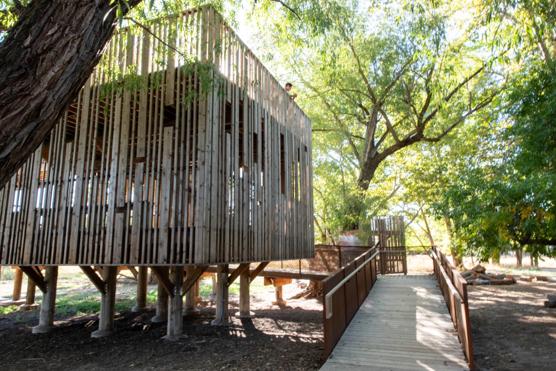
The Dumke Picnic Grove provides an updated woodland gathering space that seamlessly connects visitors with the Ogden Nature Center's 152-acre habitat. EDA's comprehensive renovation of the space included two refurbished treehouses anchoring the site featuring reclaimed Douglas fir poles from Union Pacific's historic Lucin Cutoff trestle over the Great Salt Lake. Our team developed the new event pavilion with food prep space, restrooms and covered serving area that defines the west edge of the extensively relandscaped zone. Other outcomes of our design is a creek-view terrace, fire pit and varied seating areas for camps, parties and meetings. Serving as an outdoor classroom, event venue and birdwatching location, the Grove exemplifies sustainable design that honors both natural heritage and community needs.
Utah Veterans Memorial
West Valley City
- Catalog No.2708
- ClientWest Valley City
- Area8,000 SF
- Completion2022
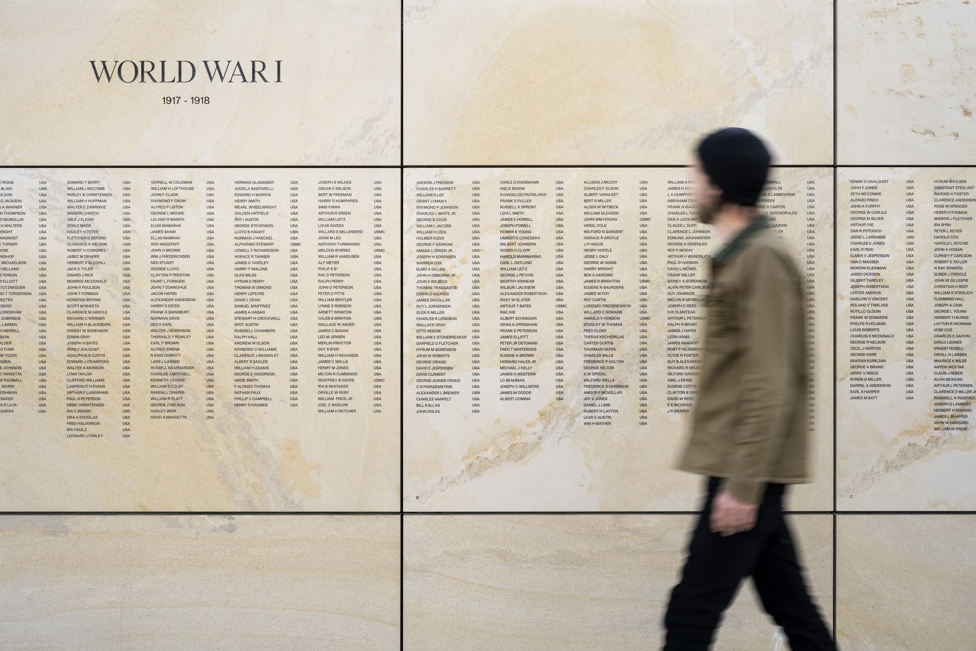
Honoring Utah's fallen heroes, the Utah Veterans Memorial invites solemn introspection and connection within a respectful space to remember and reflect upon those memorialized. Sited on just over three acres, its only two entrances guide visitors into the plaza facing east, allowing the prominent Wasatch Front in the distance to set the tone upon entry – as if the mountains are paying homage to those memorialized within. Upon entry, visitors find themselves in a subdued yet fitting space. The placement of the names scribed into the wall’s east side, eternally facing the mountains, allow them to be discovered after entry upon turning towards the wall. Arranged chronologically by war and dating back to World War I the names, listed in a random order, form a single continuous roll call of those united in their common sacrifice. At the center of the plaza, two quartzitic sandstone monoliths quarried from nearby Brown's Canyon align to present an outline of Utah. The facing sides of each slab are carved to reflect Zebra Slot Canyon, with a relief at the base representing the canyon’s runoff wash.
Justice Court Renovation
West Valley City
- Catalog No.2987
- ClientWest Valley City
- Area20,600 SF
- Completion2023
Harmonizing security with public access, the renovation design reimagines the space. We developed dignified spaces for the public with ‘soft’ interview rooms to reduce the trauma for certain people testifying. Acknowledging the courts system is a stressful place we incorporated several biophilic design strategies to reduce occupant stress-levels, improve the sense of well-being and passively improve staff’s ability to maintain a high degree of safety and security. Strategies to accomplish this include maintaining visual site lines throughout allowing staff to readily observe all areas within the facility, Our utilization of natural materials such as wood, stone and even plants throughout the space to re-enforce a connection between the occupants and nature. Everywhere possible we invited natural daylight into spaces within the facility. Our design enabled the opening of exterior walls to invite daylight into offices, cubicles and public spaces, including introducing diffused natural daylight into the courtrooms. We also provided the opportunity for justice among those within the community without internet access by carving out space for two sound-isolated virtual hearing booths in the main lobby.
Fairbourne Station Parking Garage
West Valley City
- Catalog No.2129
- ClientWest Valley City
- Area420,000
- Completion2020
- Awards
- 2020 Utah Design and Construction Most Outstanding Concrete/Structure Project
The seven-level, 420,000 SF Fairbourne Station Parking Structure in West Valley City provides a fifty- year parking structure for visitors riding UTA buses and Trax, West Valley City employees and the office building tenants of the Fairbourne Station Office Tower. The structure is equipped with a snow-melt system built into upper level clear of snow in the wintertime as well as negating the need for snow-plow storage. Additionally, the design allows the unique inclusion of small retail spaces on the ground level that will enliven the outdoor area surrounding the parking structure. The glass curtain walls and smart design elements on the northeast corner match the surrounding buildings and connect to the adjacent office tower via a second-story sky bridge, while openings in the concrete facade bring in natural light to the 1,200 stalls inside. Utilizing a moment frame allowed for the exclusion of shear walls, thereby increasing user safety by eliminating blind spots.
Wasatch County Administrative Building
Heber, UT
- Catalog No.3482
- ClientWasatch County
- Area62,000 SF
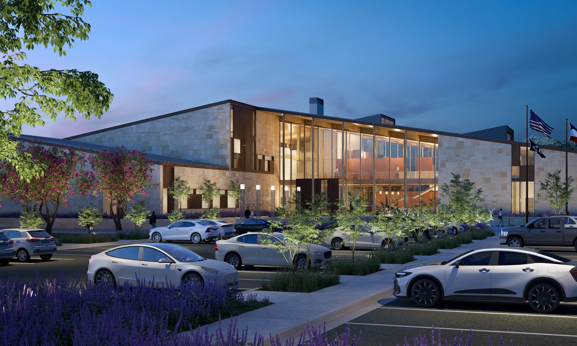
Currently in design, Wasatch County’s new Administration Building brings departments and the public together in a civic space rooted in clarity, sustainability and connection. The purpose-built facility consolidates County services and the Council Chambers with intuitive wayfinding and thoughtful adjacencies that streamline public access while supporting staff collaboration. Warm materials, natural light and distinct circulation paths elevate the visitor experience. Designed to meet the AIA 2030 Challenge, the building features a Mass Timber structure, high-performance envelope and energy-efficient ground source heat pump system -- a future-ready design that reflects Wasatch County’s commitment to service and stewardship.
Beverley Taylor Sorenson Arts and Education Complex
Salt Lake City
- Catalog No.2184
- ClientUniversity of Utah
- Area115,000 SF
- Completion2014
- Awards
- 2014 AIA Utah Honor Award
- 2014 ENR Mountain States Best Higher Education Project
- Certifications
- LEED Silver
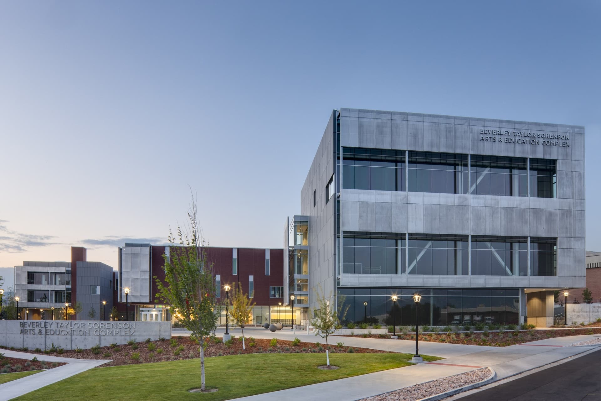
The state-of-the-art teaching facility houses the University of Utah’s College of Education, the Tanner Dance Program and College of Fine Arts. Additionally it features a new collaborative research area and new faculty and administrative offices for the College of Education. The space promotes cross-disciplinary collaboration through a well-conceived dynamic framework for bringing people together in a vibrant and inspiring setting. A single circulation spine connects the building’s entrances and public gathering areas, resulting in an internal "street" supporting meeting, socializing, dining and studying. Transparent to both indoor and outdoor activities, the street’s walls expose a vibrant culture of shared community.
The design was informed by the University’s Climate Action Plan and – through careful planning and design -- achieves over 40 percent savings on energy usage over typical facilities of its kind. Alongside classrooms and offices, the facility's spaces include rehearsal studios, rehearsal/performance space, visual arts studios, costume design and fabrication shop, technology-supported classroom spaces and large multipurpose/lecture space.
Cleone Peterson Eccles Alumni House Renovation
Salt Lake City
- Catalog No.2568
- ClientUniversity of Utah
- Area33,500 SF
- Completion2019
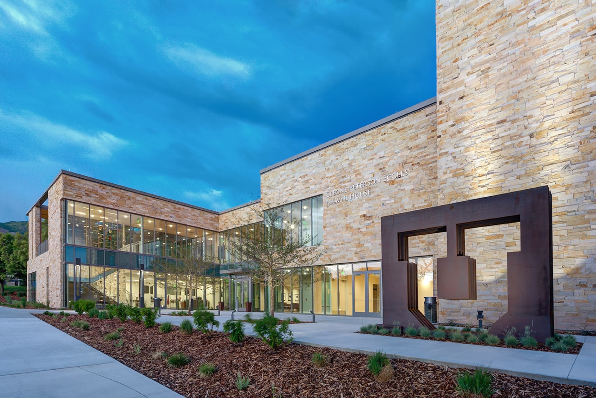
Our solution accomplished the University's goals of expanding and renovating the conference, meeting and entertainment hub for alumni activities. Our design increased capacity and improved connections to the campus through carefully organized, flexible spaces. The uncomplicated material palette favors the quality and richness of materials - such as regionally inspired stone walls on the exterior and wood paneling inside - with a subtle integration of University colors referencing its campus context. Reusing approximately 50 percent of the original building fabric, our thoughtful programming provides vistas to important local landmarks including the iconic Block U, Rice Eccles Stadium and the State Arboretum as well as views into the event spaces from the campus’ main corridors.
Utah State Fairpark Master Plan
Salt Lake City
- Catalog No.3065
- ClientUtah State Fair Corporation, DFCM
- Area65 ac
- Completion2021
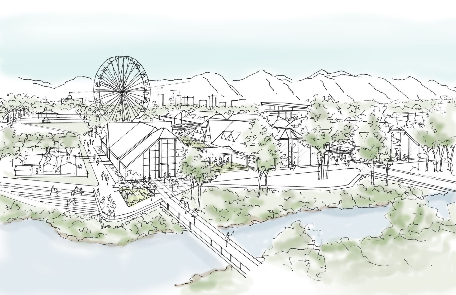
The 15-year comprehensive master plan for this unique state asset explores and guides opportunities for investment, improvement and expansion. Our team's focus included encouraging year-round activity and exploring revenue streams to ensure the long-term financial viability of the State Fair and the Fairpark itself. Our team performed detailed surveys of the site, the existing facilities and potential development location as well as conducted outreach to the surrounding community through scheduled meetings and in-person and online surveys. The process resulted in a plan that optimizes the Fairpark layout within current boundaries while mitigating negative impacts such as traffic and parking on the surrounding community. The resulting plan divides the site into seven districts including the Jordan Riverwalk, Historic Core, Conference and Expo, Adventure, Animal Experience, Hospitality and White Ballfield.
Performing Arts Center Feasibility Study
West Valley City
- Catalog No.3407
- ClientWest Valley City
- Area33,100 SF
- Completion2018
Our study explored opportunities to improve the West Valley City Theater building's ability to provide a state-of-the-art performing arts center for the community of West Valley City. Ideas generated by the study included redefining the image of the facility through spaces such as a large modern, iconic and transparent lobby. We also reviewed relocating the box office, retrofitting the existing theatre-in-the-round, providing a new black box/multipurpose event space and site improvements such as new landscaping, pedestrian accessways, vehicle movement areas and parking.
Fairbourne Station Mixed Use Master Plan
West Valley City
- Catalog No.2435
- ClientWest Valley City, Wasatch Commercial Management
- Area15 ac
- Completion2020
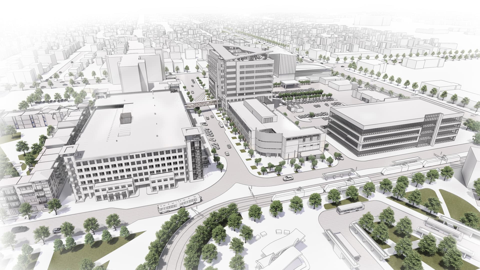
We led a group of stakeholders to develop a cohesive urban design vision and development strategy to master plan Fairbourne Station, West Valley City's evolving mixed-use downtown district. Located on a compact 15 ace urban site with adjacencies to City Hall and West Valley Central Station TRAX stop the focus included developing a services and amenity rich walkable District. The overall vision clusters high density residential, hospitality, retail, several civic and municipal services, clinical and medical offices and class A commercial office space around community green space.
As part of the over $80 M buildout of the master plan's phase 1, we worked with the City and developer to design and construct the Police Department, Fairbourne Station Office Tower and the District's parking garage.
Ogden Nature Center Master Plan
Ogden
- Catalog No.2760
- ClientOgden Nature Center
- Area152 ac
- Completion2018
The Ogden Nature Center (ONC) is a 152-acre wildlife habitat dedicated to environmental education and preserving Utah’s natural heritage. Members of EDA have worked with ONC since 1993 on projects such as its Interpretive Center and L. S. Peery Education Center. Envisioning a unified sense of place while championing environmentally responsible design and planning, we approached the master plan by addressing three critical systems: Built, Human and Natural. The Built System encompassed analyzing physical structures like buildings, mews and visitor centers to identify needs. The Human System focused on user experience and site quality addressing factors such as entryways, parking, trails and amenities. The Natural System evaluated the site's vegetation, wildlife and water resources with recommendations such as enhancing the natural landscape with native-adapted designs, improving irrigation strategies and employing a sustainable water management plan that provides for a stormwater detention system, reduced reliance on potable water and exploring water rights from Millcreek. The final master plan serves as the blueprint for ONC's sustainable future, inviting visitors to reconnect with nature in a revitalized, welcoming environment.
West Valley City Library Feasibility Study
West Valley City
- Catalog No.3406
- ClientSalt Lake County Public Library, West Valley City
- Area20,000 SF
- Completion2019
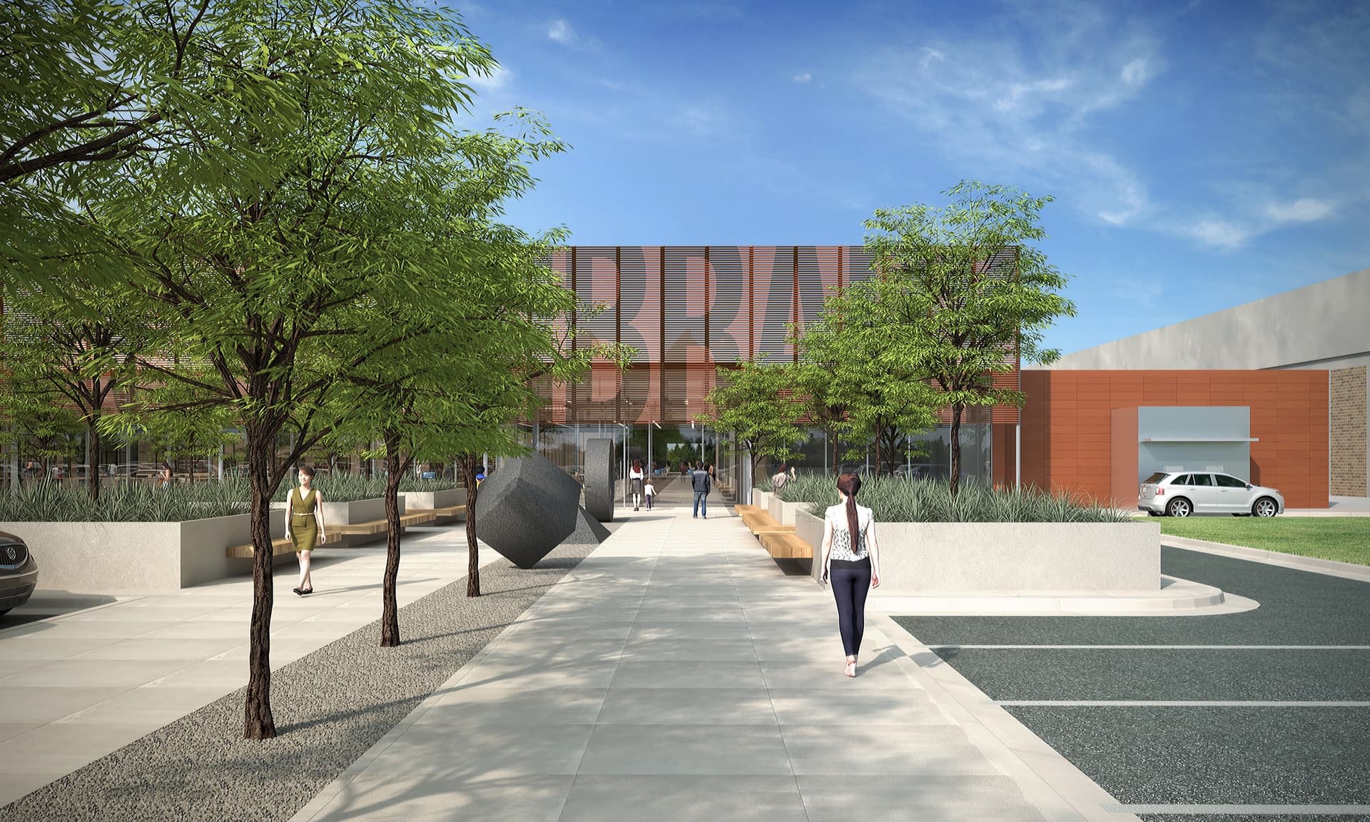
We explored the opportunity to develop an unconventional site for a potential future library site: a dense, interior retail and storage space at the Valley Fair Mall. Our proposed solution lightens the space by introducing a large, central outdoor courtyard which provides daylight and 'views' into all of the programmatic elements including the children's and teen's areas, makerspace, computers and main library stacks. For the exterior our team explored the ability to convert a vast parking area into a public green space to serve as a welcoming gesture toward patrons coming into the library. At the interior mall entrance, we introduced a cafe as a retail space to draw patrons from inside the mall.
Treehouse Museum Study
Ogden
- Catalog No.2945
- ClientTreehouse Museum
- Area45,000 SF
- Completion2019
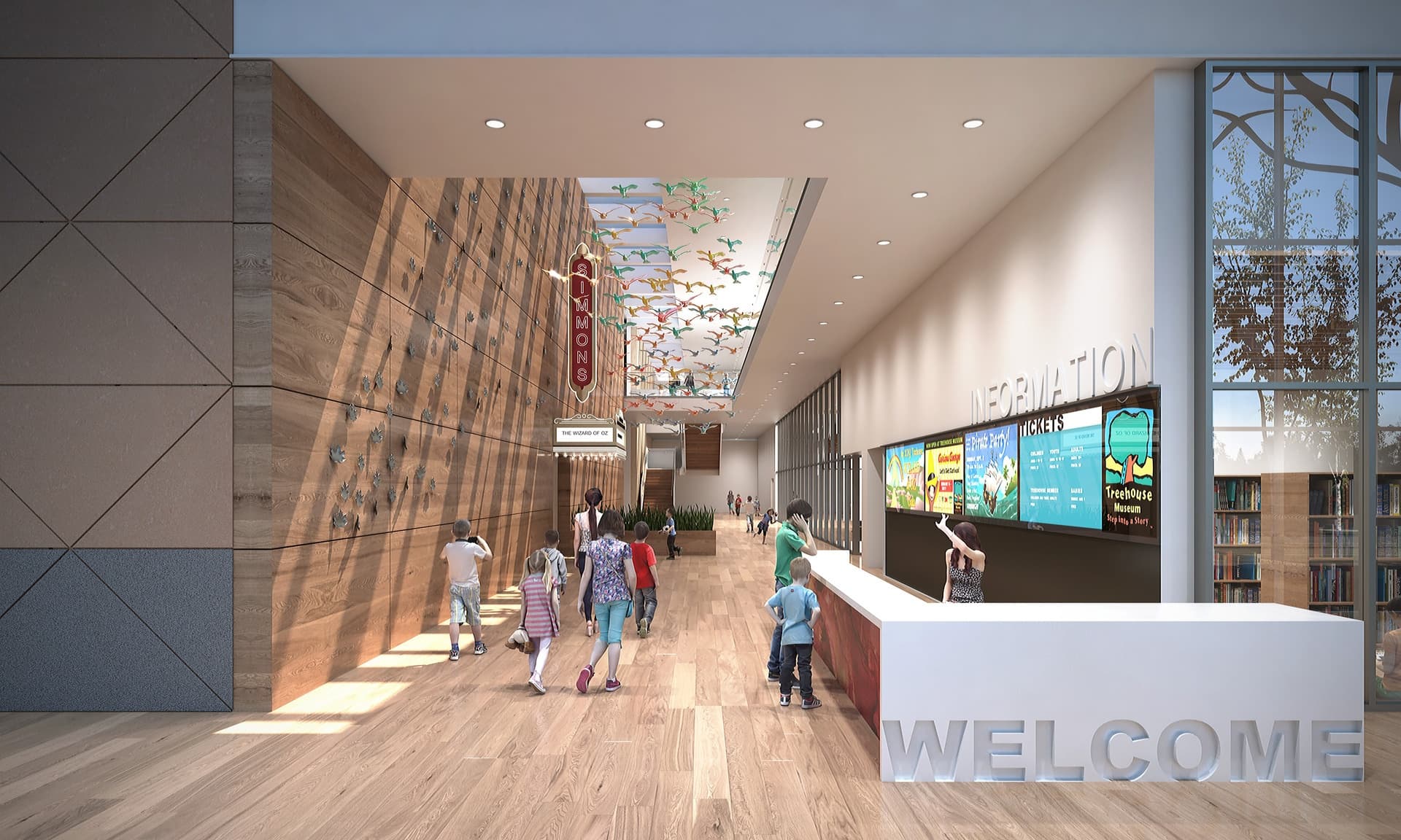
The design study to expand for the children’s museum while developing a transparent, vibrant, welcoming presence from 22nd Street. Our proposed solution included design redefining the existing entrance to provide larger and more accessible support for the Storybook Theatre on the main level and a new Grand Party room overlooking the lobby and city. The building's second story overhangs and serves as a sheltered walkway along the west length of the building. The glazed lobby facing 22nd street is a transparent and dynamic presence with convenient entrances at each end. The two-story public lobby, which includes space for promoting current and future Treehouse programs, accommodates gatherings for school groups and other visitors prior to entering the museum-proper. It adjoins a double height atrium space that connecting the west side of the existing building to the new two-story exhibit wing.
USU Moab New Building | Campus Feasibility Study
Moab
- Catalog No.2739
- ClientUtah State University
- Area28,527 SF
- Completion2018
- Awards
- 2013 ASLA Utah Honor Award
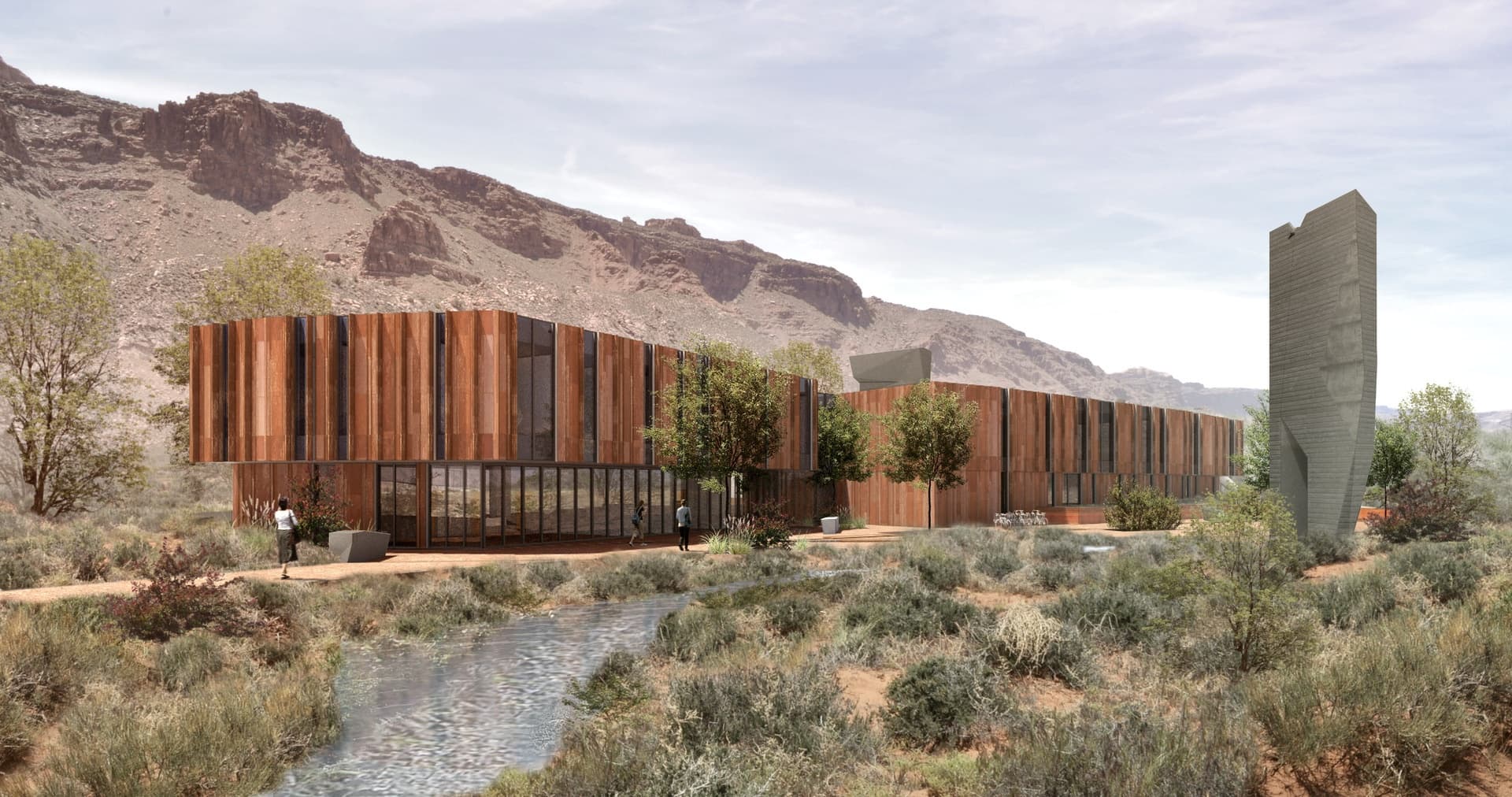
EDA's feasibility study and master plan focused on developing a 40-acre greenfield for a regional campus. As part of an initial visioning session, the project stakeholders and design team collectively decided the future Moab campus will have regionally appropriate architectural character, letting the site qualities define the character of the development. EDA developed the conceptual plan, materials palette and donor graphics.
Main and Athletic Campus Master Plan
Vineyard
- Catalog No.2272
- ClientUtah Valley University
- Area200 ac
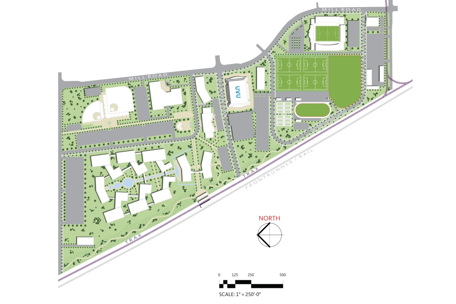
- Completion2015
The 50-year horizon Vineyard Campus Master Plan envisions an entirely new campus on over 200 acres of land in Vineyard Utah previously used as a steel mill. During a year-long discovery process, our team identified main challenges as connectivity between the new and Orem campuses, maintaining the academic integrity of the Orem campus and fostering a sense of community with neighbors of the university during this period of growth. Opportunities we explored include expanding the growing colleges and student programs, space to enlarge student life activities and land for public/private partnerships to enhance learning.
Daybreak South Station Office Study
South Jordan
- Catalog No.2016
- ClientKennecott Land
- Area160,000 SF
- Completion2016
The feasibility study for Daybreak's South Station District at the end of the TRAX Red Line explored a transformative 4,000-acre master planned community. Referred to as Downtown Daybreak, we envisioned a walkable, transit rich, mixed-use office, civic and retail core at its heart. Embodying the human scaled design principles of the “New Urbanism” movement, the first phase in our proposed development is a 150,000 SF office building and 10,000 SF neighborhood retail building.
J.L. Sorenson Recreation Center
Herriman
- Catalog No.1668
- ClientSalt Lake County
- Area107,000 SF
- Completion2011
- Awards
- 2011 ENR Mountain States Best Green Project
- Certifications
- LEED Gold
The flagship recreation facility anchors a public plaza shared with the EDA-designed Herriman Library. Serving the diverse needs of three growing cities, our design derived from the vision and needs identified through close collaboration with Salt Lake County, Herriman City, Community Citizens and Local School District and public open houses. The result is a state-of-the-art recreation center designed around sustainable strategies and meaningful locally-sourced materials such as copper clad metal composite panel feature walls blended with aluminum composite panels. At its opening, the LEED Gold center was the County's largest, most energy efficient recreation facility. Inviting natural light in and providing a sense of visual connection and safety our design features numerous large exterior and interior windows.
John W. Gallivan Plaza Center and Ice Rink
Salt Lake City
- Catalog No.2186
- ClientRedevelopment Agency (RDA) of Salt Lake City
- Area21,584 SF
- Completion2014
- Awards
- 2012 AIA Utah Merit Award
- 2012 IIDA - Intermountain BEST - Play
- 2012 Downtown Alliance Achievement Award
- Certifications
- LEED Gold
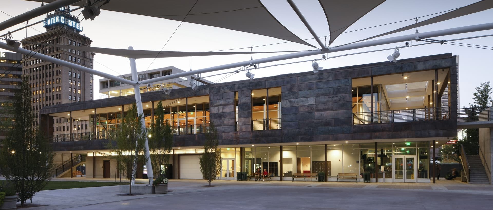
As Salt Lake City’s living room, John W. Gallivan Plaza supports a wide range of activities and events, including the Twilight Concert Series, winter ice skating, and arts and food festivals. WE have developed a number of design solutions at Gallivan over the course of nearly three decades. Among these are a set of retail shops along Gallivan Avenue, the current amphitheater and ice sheet, and the 21,000 square foot event center/ice support building that won a 2012 AIA Utah Merit Award.
The event space represents the capstone of the Gallivan Center master plan. Built on top the existing Gallivan Center parking, the event space creates a sense of enclosure for the park. Composed of a steel frame, copper paneling, and cast-in-place and pre-cast concrete, it presents a warm and enduring face while honoring the region's long mining history. The building’s lower floor provides support for the ice sheet and the amphitheater. Ringed by balconies its second story expands the center’s conference and special event capabilities. A planted roof positively contributes to the park’s aesthetics when viewed from surrounding buildings.
Summit County Health Services
Park City
- Catalog No.1192
- ClientSummit County
- Area25,000 SF
- Completion2007
We approached the design with the philosophy that those working to promote community health should experience a healthy work environment themselves. Our “healthy building” maximizes natural daylight in working spaces while ensuring energy efficiency through passive solar orientation, draft-resistant construction and a geothermal heat pump. The "100 Mile Building" is built from locally sourced materials such as Browns Canyon stone, local Zinc panels and local timber. The Center houses the County Health Department and provides space for the People’s Health Clinic - a non-profit organization that offers basic health services to uninsured residents.
L.S. Peery Environmental Education Building
Ogden
- Catalog No.0971
- ClientOgden Nature Center
- Area7,000
- Completion2006
- Awards
- 2008 AIA Utah Honor Award
- 2008 AIA Utah Sustainability Award
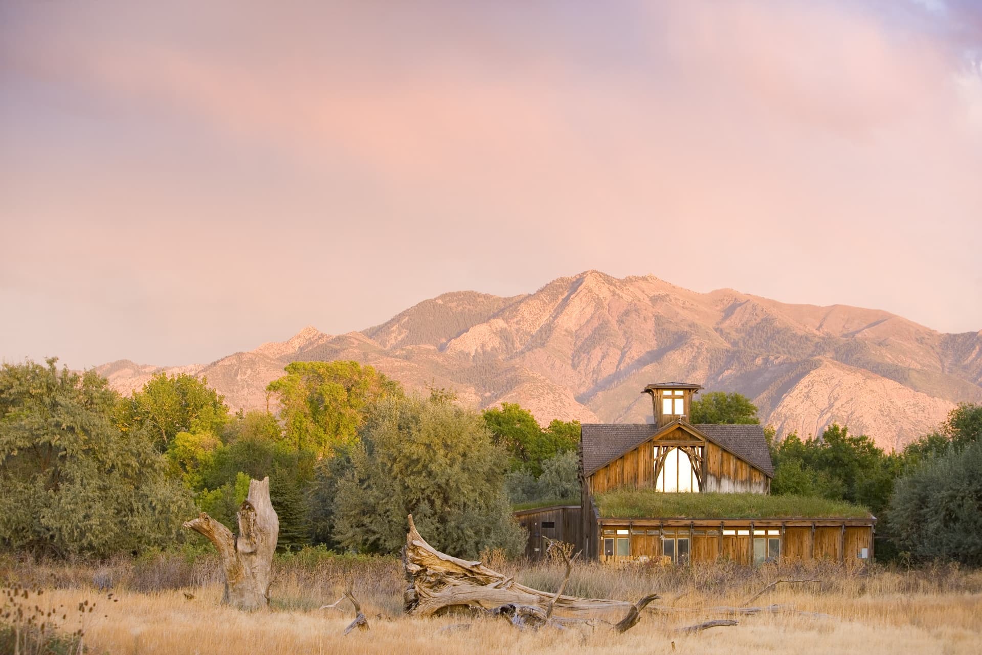
Accommodating over 20,000 visitors a year, the Education Center supports the environmental education mission and programs of the Nature Center. Its purpose is to serve as a gateway to the nature preserve and a tool to expand awareness of possibilities related to a more sustainable relationship between the built and natural environment. The building serves as a “teacher.” It incorporates a variety of environmentally sustainable materials and systems, interpreted through a range of passive and interactive exhibits. Special features include straw-bale/earthen plaster walls, salvage lumber, displacement evaporative cooling, radiant flooring, heat chimney and natural/adaptive artificial lighting. One hundred percent of the building’s energy is supplied by roof-mounted photovoltaics. Based on our site analysis, the building and fenestration orientation allows for the collection of solar energy. Shielded from the sun during the summer, the building captures beneficial breezes and protects the courtyard areas from the canyon winds emerging from the east. Spaces developed for the facility include a foyer with an interpretive gallery, classrooms for environmental study, six offices for teachers / naturalists, gift and book shop, meeting spaces and a volunteer room with an adjacent volunteer coordinator’s office. The central two-story gallery space is flanked by lean-to wings are sheltered by planted roots.
Draper Senior Center
Draper
- Catalog No.1953
- ClientSalt Lake County
- Area21,890 SF
- Completion2012
- Certifications
- LEED Gold
Drawing inspiration from modern hospitality the open, light-filled design creates an welcoming and active environment to meet the needs of a new generation of seniors. Generous usage of windows and skylights spread natural light throughout the building, while the inclusion of South Willow Creek, redirected to form a picturesque pond, enhances the site's natural charm. A LEED Gold certified building, the Draper Senior Center is not only environmentally conscious but strategically situated alongside the Draper Library and the TRAX light rail system. Its massing is thoughtfully orchestrated to harmonize with the surrounding context, ensuring that its scale complements neighboring structures despite its larger footprint.
Utah Cultural Celebration Center
West Valley City
- Catalog No.2265
- ClientWest Valley City
- Area28,000 SF
- Completion2017
The two-level expansion and renovation serves the multi-cultural needs of groups throughout its community and features an archival quality storage space that meets the requirements of Smithsonian Art Museum traveling exhibits. Our design accommodates the City’s desired programming needs to host performing art shows, K-12 arts education programs conferences and concert as well as conventions, trade shows and food festivals.
Weber County Library North Branch
Ogden
- Catalog No.2567
- ClientWeber County Library System
- Area21,625 SF
- Completion2019
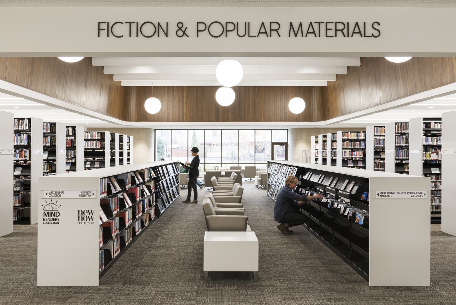
Following a successful bond campaign, our process to identify opportunities for improvements involved a a rigorous evaluation of systems and resources. Our process included engaging in collaborative community and user input to uncover everyday users needs to arrive at consensus between the County and the City of North Ogden. The resulting solution doubled the library's program space while providing an updated front entry and new rear entry and façade.
The new spaces within opens up to and welcomes constituents into a an entirely refreshed and modern presence.
Weber County Main Library Historic Restoration
Ogden
- Catalog No.2135
- ClientWeber County Library System
- Area55,680 SF
- Completion2019
- Awards
- 2019 Library Journal Magazine New Landmark Libraries - Honorable Mention
- 2019 Preservation Utah Heritage Award
Seamlessly marrying the contrasting needs of a library in the digital age and the preservation of a gem of mid-century modernist architecture, this transformation updated the library while positioning it for inclusion on the National Register of Historic Places. Recognizing its architectural and community significance, we engaged extensively with Ogden's residents, leaders and library staff throughout the design process. The resulting design led to a thirty percent increase in publicly accessible spaces and modern technology and building systems. The dual-focused the design efforts developed a facility that functions as a repository of books and provides community access to multi-media resources.
In addition to the traditional book stacks and reading areas, the renovated library features interdisciplinary spaces to house dedicated science, technology, engineering, arts and math (STEAM) education-focused spaces. Developed due to needs expressed by the client and community, these community spaces include maker spaces for functions such as film making, general arts studio and small theaters to accommodate readings and music recitals and performances.
As part of preserving the historical integrity, all the original walnut paneling was preserved; most of which was protected in place and carefully refinished. The special collections room in the basement, outfitted with rose wood paneling, was protected through abatement, demolition and new construction phases. The design introduced a new plaza connecting the library to its natural surroundings and incorporated contextually sensitive architectural elements such as new entries and windows to foster community engagement.
Fourth District Courts and City Police Facility
Spanish Fork
- Catalog No.1480
- ClientSpanish Fork City
- Area60,182 SF
- Completion2009
- Awards
- 2008 AIA National Justice Facilities Review
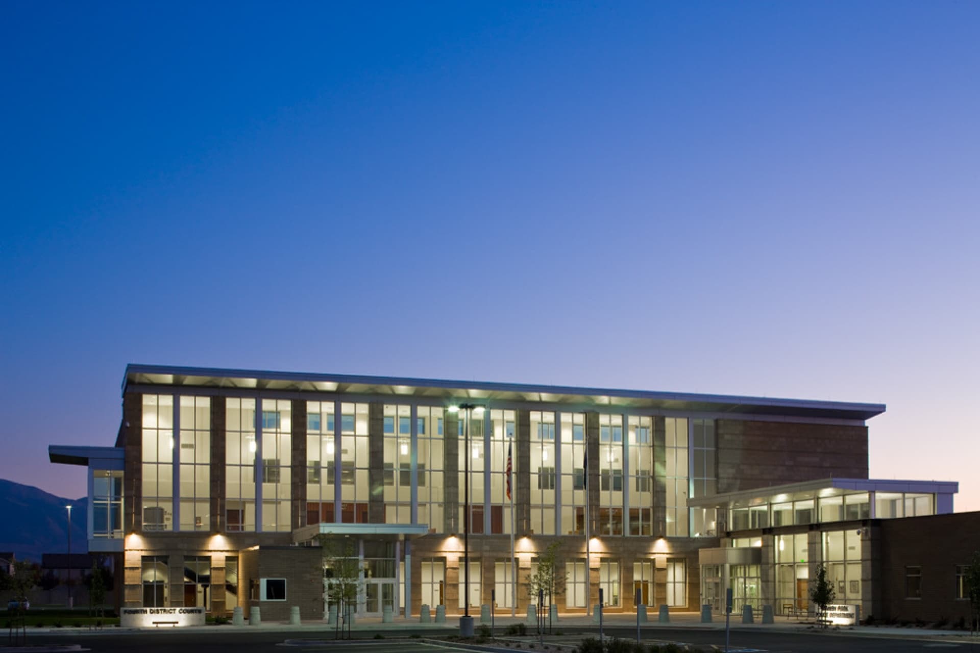
The contemporary design draws on traditional architectural organization with a focus on reflecting Spanish Fork’s strong rural traditions and identity while telling the story of the area’s local masonry tradition. The two-wing solution provides separation between courts and justice functions and the police, each with a separate entrance, while anticipating future expansion needs. To inform the program and design we applied an inclusive, consensus-building and creative problem solving approach to lead the interface between the City, Police Department, Administrative Offices of the Court and Utah County Sheriff’s Department. Siting the building we integrated CPTED (crime prevention through environmental design) and building security criteria with urban planning and design considerations to promote walkability, transit connection and public place-making.
Farmington City Hall
Farmington
- Catalog No.1676
- ClientFarmington City
- Area21,267 SF
- Completion2010
- Awards
- 2010 Mountain States Construction Gold Award - Intermountain Best
We engaged the community to develop a city hall that - rather than having a modern design - reflects the unique culture and heritage of the City's historic core and Main Street. Our solution provides a contextual design response, embodying the character of the surrounding Farmington neighborhood. To scale down the overall building mass, the facility is comprised of four discrete building wings joined by a transparent atrium. Three of the wings invoke the historic frame homes along Main Street, while the fourth and principal wing is a reference to Farmington’s original red-brick city hall. Material choices and design reference Farmington’s heritage and historic architecture without being overly representational or literal. Three of the wings utilize pitched roofs, clapboard wood siding and wood windows to reflect the historic frame homes along Farmington’s Main Street. The brick-clad fourth and principal wing, evokes Farmington’s existing original brick city hall. Other materials on this portion of the building include red sandstone and gneiss granite quarried locally. The difference in materials also serve as wayfinding prompts. The glass atrium denotes the public entrance and lobby with pre-function spaces and connection to City departments, whose offices and support spaces are housed within the white wings. The principal wing’s brick points the way to the city council chambers and community room.
Moab Recreation and Aquatic Center
Moab
- Catalog No.1685
- ClientCity of Moab
- Area24,000 SF
- Completion2010
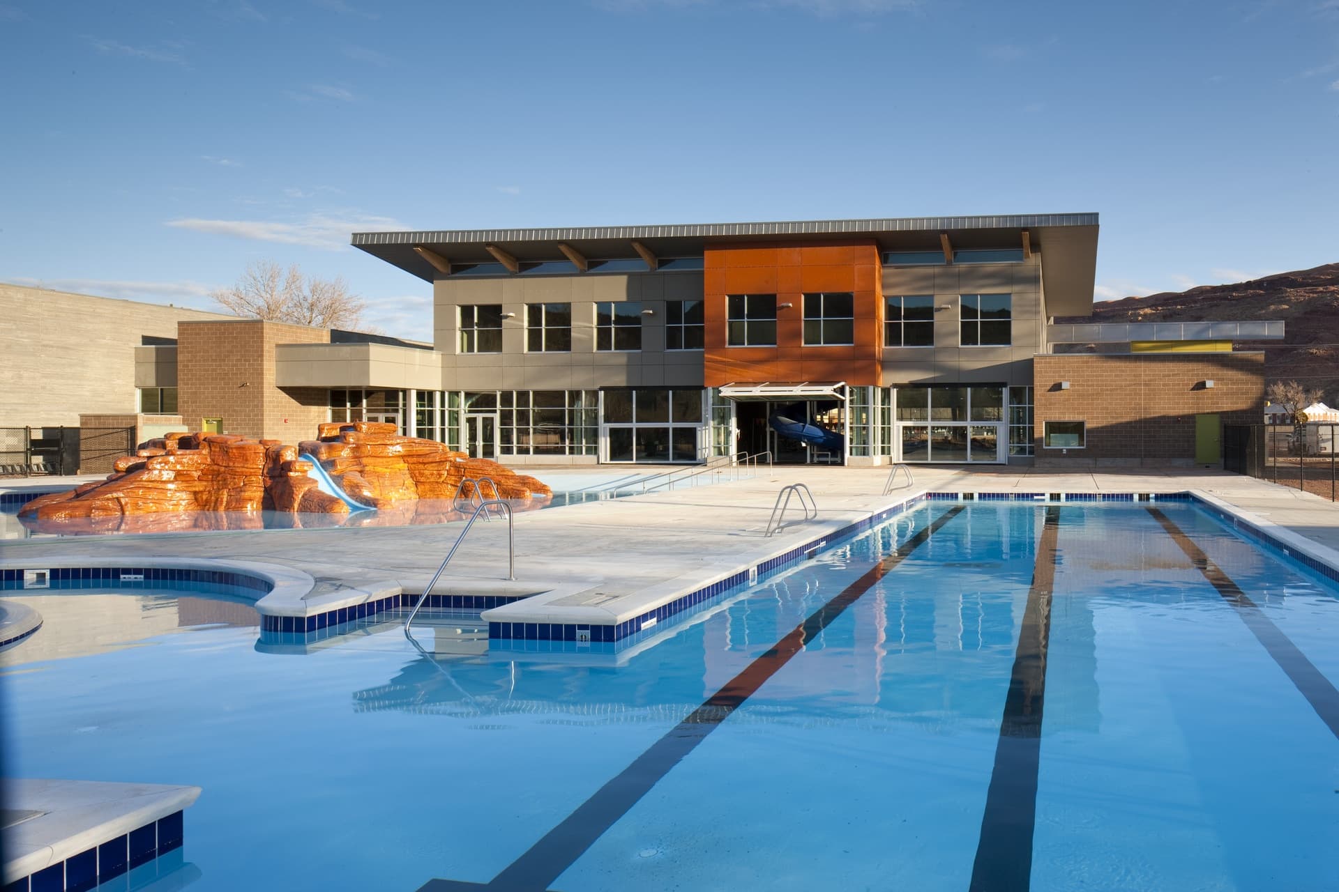
To serve a rapidly growing population, we assisted with community outreach for this new Swanny City Park indoor-outdoor pool and recreation facility. Our design – including both lap and play pools, a current channel, fitness area, exercise/party room, locker rooms and administrative offices – accommodates the needs of a broad range of users for generations to come. The materials used reflect the area's iconic landscape, considers durability and provides for ease of maintenance.
Ogden High School Historic Restoration
Ogden
- Catalog No.1078
- ClientOgden School District
- Area220,955 SF
- Completion2013
- Awards
- 2014 ACEC Grand Award
- 2014 ACEC Grand Conceptor Award
- 2013 National Trust for Historic Preservation Driehuaus National Honor Award
- 2013 ABC Utah Chapter Excellence in Construction - Historical Renovation
- 2013 ABC Utah Chapter Excellence in Construction: Project of the Year
- 2013 Utah Heritage Foundation (now Preservation Utah) Honor Award
- 2013 Ogden City Joint Resolution of the Ogden City Council and Mayor
- 2013 ENR Mountain States Best Projects: Best Renovation / Restoration Project
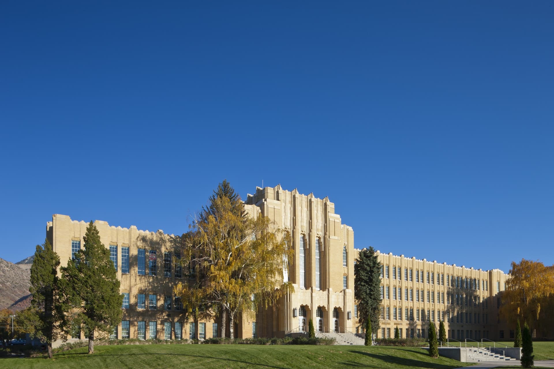
Originally built in 1937, Ogden High School is one of the best examples of Art Deco architecture in Utah.
The thoughtful multi-phased renovation and restoration of this landmark building included comprehensive programming, master planning and design services to transform it into a state-of-the-art learning environment. The renovation included restoring the historic auditorium, seismic upgrade and strategic exterior repairs. Additions to the facility included a new multi-floor athletic center, cafeteria and common space expansion, a cutting-edge science center and performing arts center. The design for these additions played off the symmetry, axial disposition and articulation of the original Art Deco design. The new athletic center stands on the major axis of the original building, defining a fourth corner of the new outdoor quad. A transparent curtain of glass encloses the new commons space, providing views to the quad and the mountains east of the campus.
South Weber K-2
South Weber
- Catalog No.1670
- ClientDavis School District
- Area50,000 SF
- Completion2010
- Awards
- 2012 AIA Utah Merit Award
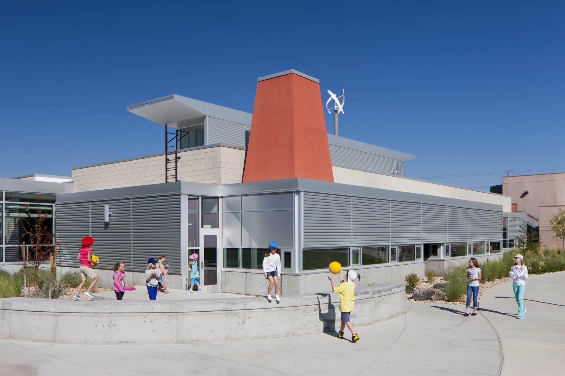
EDA’s design for the K-2 Center expresses the principle of building as teacher. Through its architecture, the building educates students about the surrounding natural environment, incorporating elements that illustrate sustainable strategies unique to the school’s location at the mouth of Weber Canyon. Here, the same strong down-canyon winds that inspired the school’s mascot, a windjammer sailing ship, animate a design theme of “wind, water and sky.” The building incorporates renewable energy, natural daylighting strategies, passive heating and ventilation, water conservation and reuse, and material resource efficiency, among others. Unique elements include periscopes (i.e. light wells), wind turbines, photovoltaics and a solar hot water array.
Fort Douglas PX Building Remodel
Salt Lake City
- Catalog No.2022
- ClientUniversity of Utah
- Area12,000 SF
- Completion2013
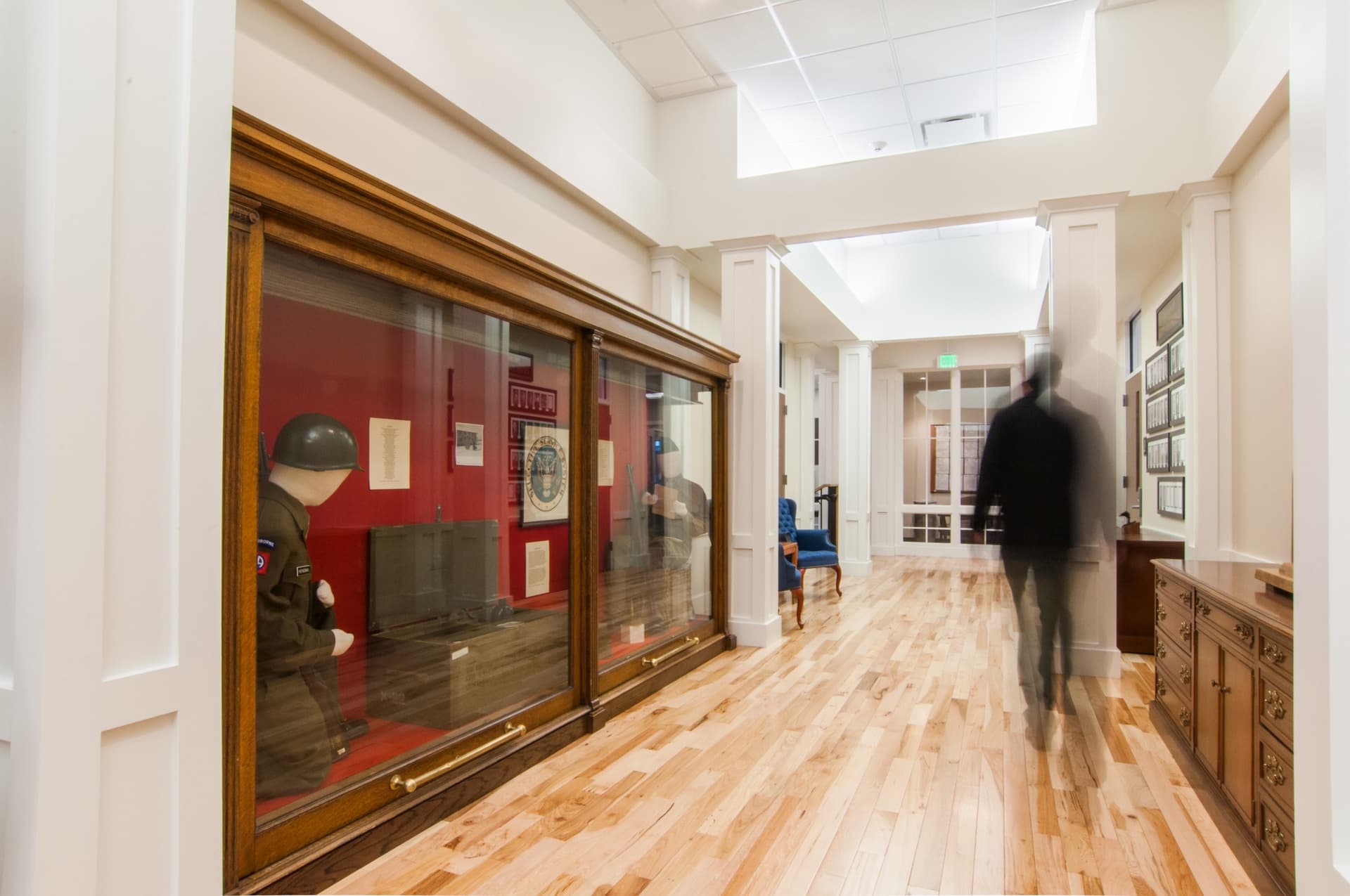
Fort Douglas, an historic military facility located on the east side of the University of Utah campus, is a National Historic Site founded shortly after the Mormon pioneers entered Utah. Our approach to its adaptive reuse focused on creating state of the art facilities without undermining the character defining attributes of the original building fabric. Constructed in 1905, it had served military personnel at the Fort since its construction. During the 1980s the building went through the first of many subsequent remodels, eventually becoming campus storage and falling into disrepair. In the early 2010s the building was selected to serve as the new home for Military Science. Our restoration design provided spaces for classrooms, offices, library, faculty and cadets lounge and uniform and equipment storage.
Questar Headquarters
Salt Lake City
- Catalog No.1578
- ClientDominion Energy (formerly Questar)
- Area170,000
- Completion2012
- Certifications
- LEED Gold
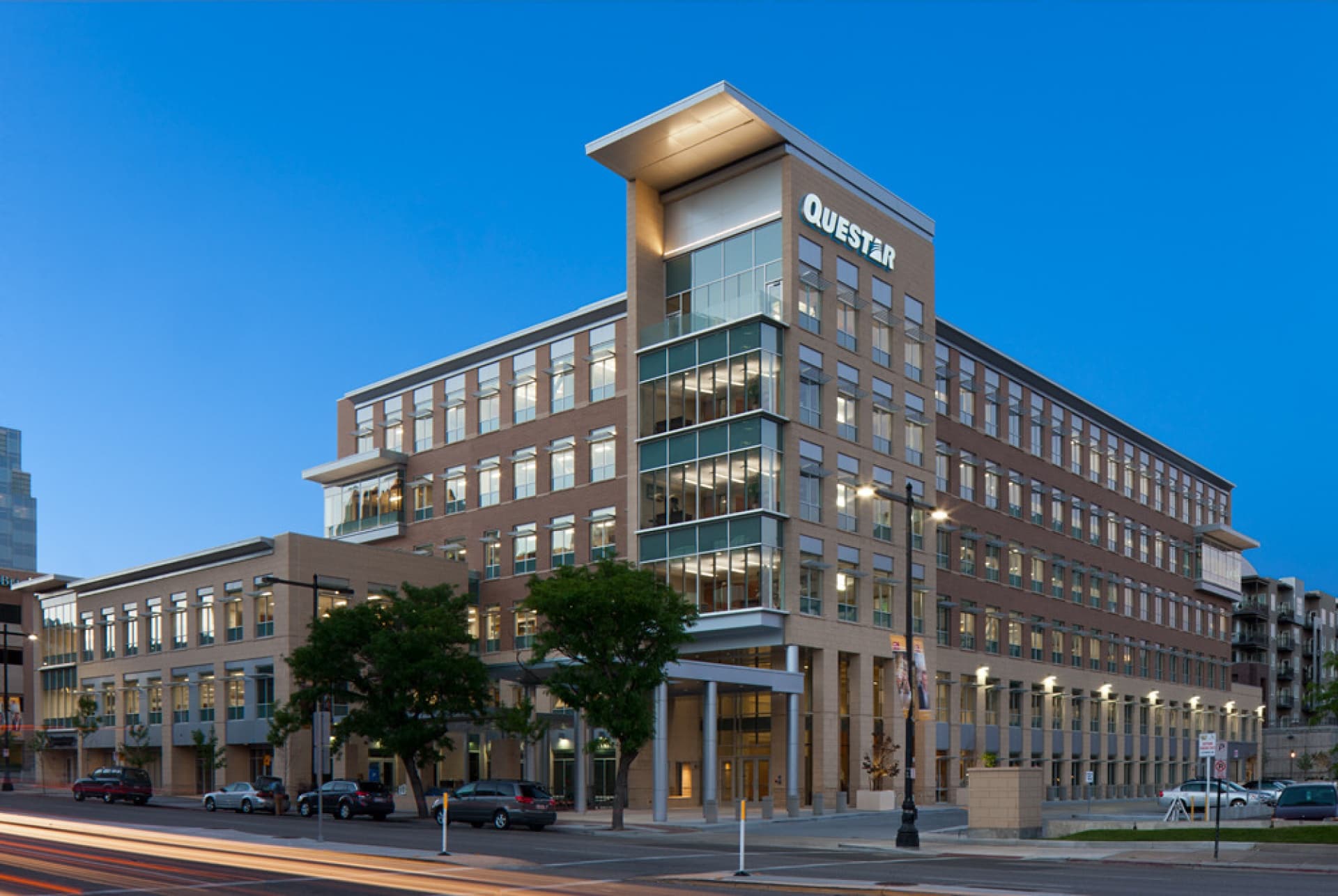
Working closely with natural gas service supplier Questar (now Dominion Energy), we evaluated the headquarters facility to assess its optimal space needs. Our evaluation led to the company relocating its headquarters to a 170,000 SF space, resulting in a twenty percent reduction in leased space. Our office-space design provides a single, purpose-built headquarters that effectively marries four separate entities – gas, pipeline, Wexpro, corporate – under a single unifying Questar brand. Through a series of workplace strategy sessions, we arrived at a common set of design rules for the office environment to reflect its corporate culture. Using abstract natural gas branding images subtly reinforced the Questar culture. By providing common amenity spaces serving all four entities the environment enhances the work place culture and promotes the attraction and retention of high quality staff.
